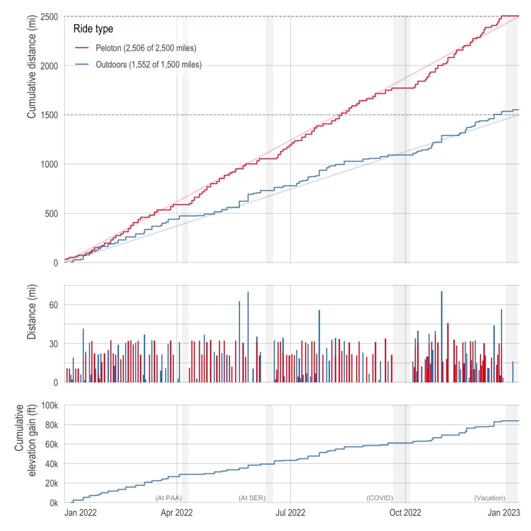
ne of the best things about living in California is having amazing weather nearly all year long (the current 3-week-stretch-of-non-stop-rain aside). So last year, I decided to capitalize on the weather and made a New Year’s resolution to bike outdoors more. Specifically, I wanted to bike 1,500 miles outdoors in addition to my normal indoor biking of 2,500 miles. (Also, with a side quest of 100,000 feet of cumulative elevation gain.) Below is a plot of my cumulative distance (and elevation) over the course of the year. I just barely got the distance resolutions with 1,551.7 miles outdoors and 2,506.1 …
It finally happened — I got COVID
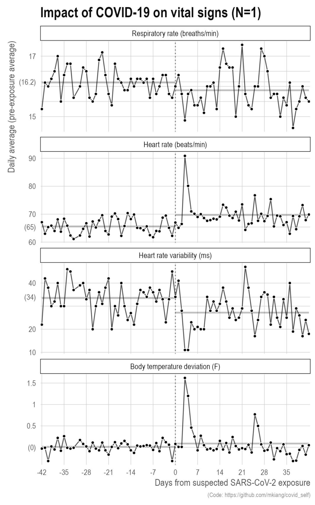
ast September, I got COVID. It was wildly unpleasant with serious brain fog that lasted for several weeks even after the other symptoms went away. That said, this did give me the opportunity to make some more plots based on my own data. Below, I show a few metrics of my vital signs (respiratory rate, heart rate, heart rate variability, and body temperature deviation) relative to my exposure (vertical dotted line) for six weeks before and after. The thicker grey lines in the background are the pre- and post-exposure averages for those six weeks.
Student’s Tay Distribution
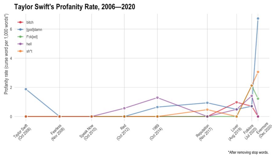
aylor Swift has recorded 9 albums, each of them (except the most recent) has gone multi-platinum. In total, she has sold over 200 million records, won 10 Grammy’s, an Emmy, 32 AMA’s, and 23 Billboard Music Awards. Not bad for somebody who just turned 31. This year, she’s managed to release two albums — they’re both very good. However, I noticed there seemed to be more profanity than I had remembered on her older albums. Here, I’ll use tidytext to see if she has actually increased her rate of profanity or if I’m simply misremembering things.
Collaboration network from 2010 to 2019
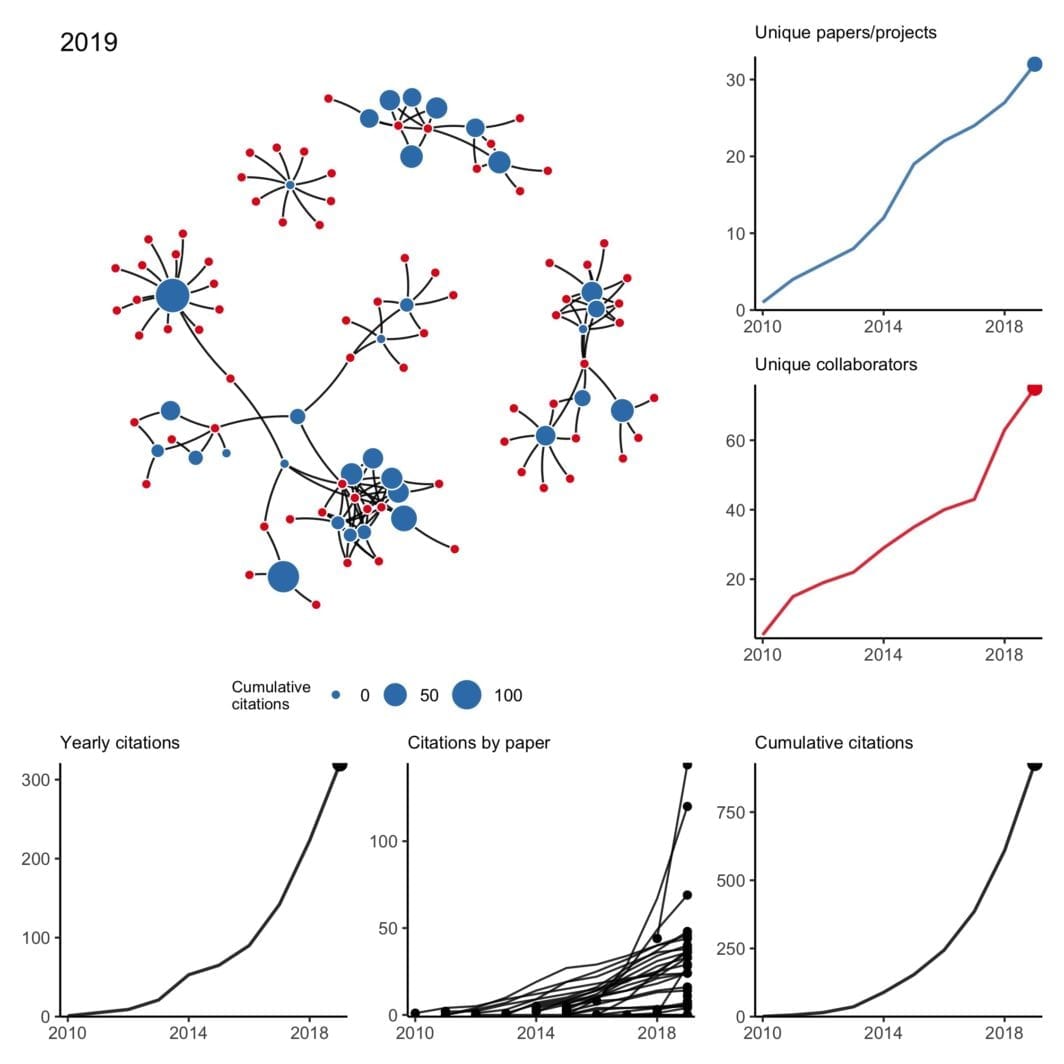
have been trying to wrap my head around working with temporal networks — not just simple edge activation that changes over time but also evolving node attributes and nodes that may appear and disappear at random. What better way than to work with a small concrete example I’m already very familiar with?
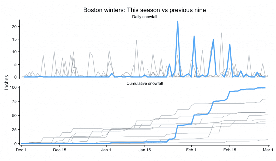
tldr; San Diego weather is better than Boston weather
am taking a break from a crazy couple months of writing and coding by… writing code. Just a quick post comparing weather in Boston (where I am) to weather in San Diego (where I’m from). While the New York Times may have made the original, most data viz people will recognize the plot above from Tufte’s classic, Visual Display of Quantitative Information. It presents a ton of data in a clear, concise, and appealing way. The background bars show the record high and low daily temperature, the mid-ground bars show the “normal” (though as far as I can tell, normal …
Using R, Wikipedia, and SHERPA/RoMEO to show New England Journal of Medicine‘s pre-print statement is empirically false
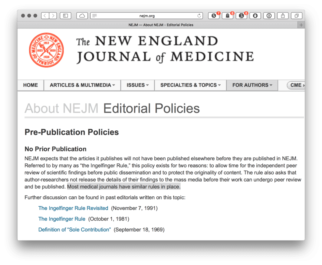
ne of the most fundamental aspects of collaborative research is sharing your work with others through pre-print or conference presentations. This isn’t likely to be news to anybody doing collaborative research these days, and many journals have become increasingly permissive with their pre-print policy. For example, Nature released an editorial making it clear, “Nature never wishes to stand in the way of communication between researchers.[…] Communication between researchers includes not only conferences but also preprint servers. The ArXiv preprint server is the medium of choice for (mainly) physicists and astronomers who wish to share drafts of their papers with their colleagues, and …
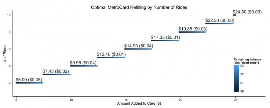
Waterfalls of Eligible Singles
s a Valentine’s Day (gag) gift to one of my friends, I created a Shiny app1 that will calculate the number of people in the United States who meet specified sex, age, marital status, race/ethnicity, educational attainment, employment status, and annual income requirements. Show 1 footnote Shiny homepage ↩