Waterfalls of Eligible Singles
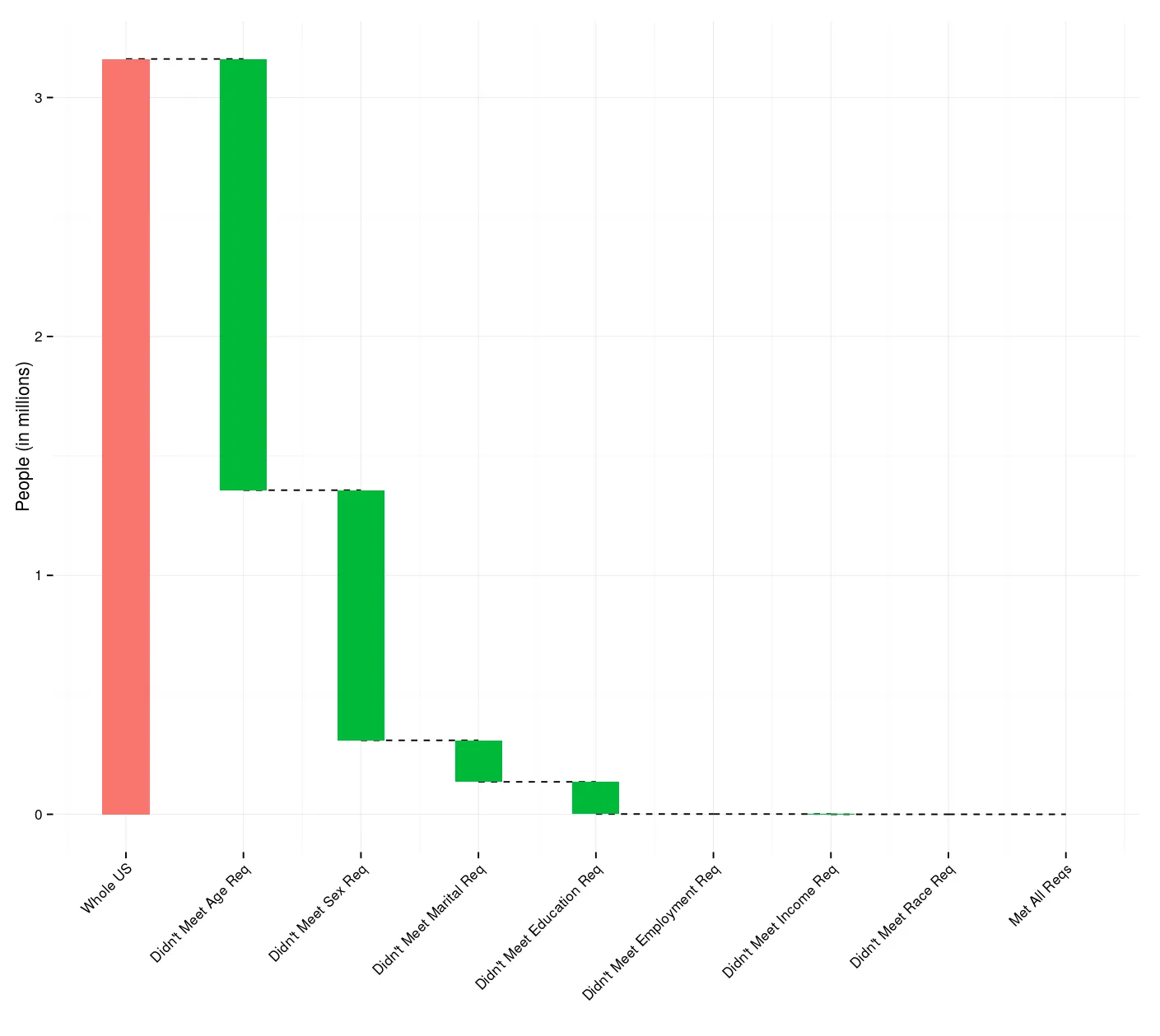
As a Valentine’s Day (gag) gift to one of my friends, I created a Shiny app1 that will calculate the number of people in the United States who meet specified sex, age, marital status, race/ethnicity, educational attainment, employment status, and annual income requirements.
It, obviously, could be used for anything, but the most direct application is to see how many people there are that are like you and how many there are that are like the person you want to be with. This doesn’t incorporate a myriad of things most people care about — like sexual orientation, attractiveness, chemistry, chiseled abs, or the ability to play guitar — but it’ll probably give you an approximation of the upper limit.
The app uses the 2013 American Community Survey2 via IPUMS.3 And all the code is up on my GitHub account.
While making it, I wanted to create a graph that showed how quickly the number of people were excluded with each category and I came across this awesome post by James Keirstead for making waterfall charts using R and ggplot2.
Waterfall charts (like the one at the top of this post4) are essentially just re-aligned bar plots, but imply a pattern about the data — specifically, how categorical factors add (or subtract) from some initial quantity. They are made to be read from left to right with the first bar representing the start and every other bar representing absolute change across the categorical variable. They’re a pretty handy tool to have in your visualization arsenal and somebody’s already done the hard part of coding it up.
Fun fact: some people refer to them as “Mario charts” because of the hanging “bricks”.5
Footnotes
-
The 1% sample since the 5% is not available on IPUMS yet. ↩
-
Steven Ruggles, J. Trent Alexander, Katie Genadek, Ronald Goeken, Matthew B. Schroeder, and Matthew Sobek. Integrated Public Use Microdata Series: Version 5.0 (Machine-readable database). Minneapolis: University of Minnesota, 2010. ↩
-
That’s a real plot of somebody matching my wife, +/- 5 years in age. ↩