· 5 min read

tldr; San Diego weather is better than Boston weather
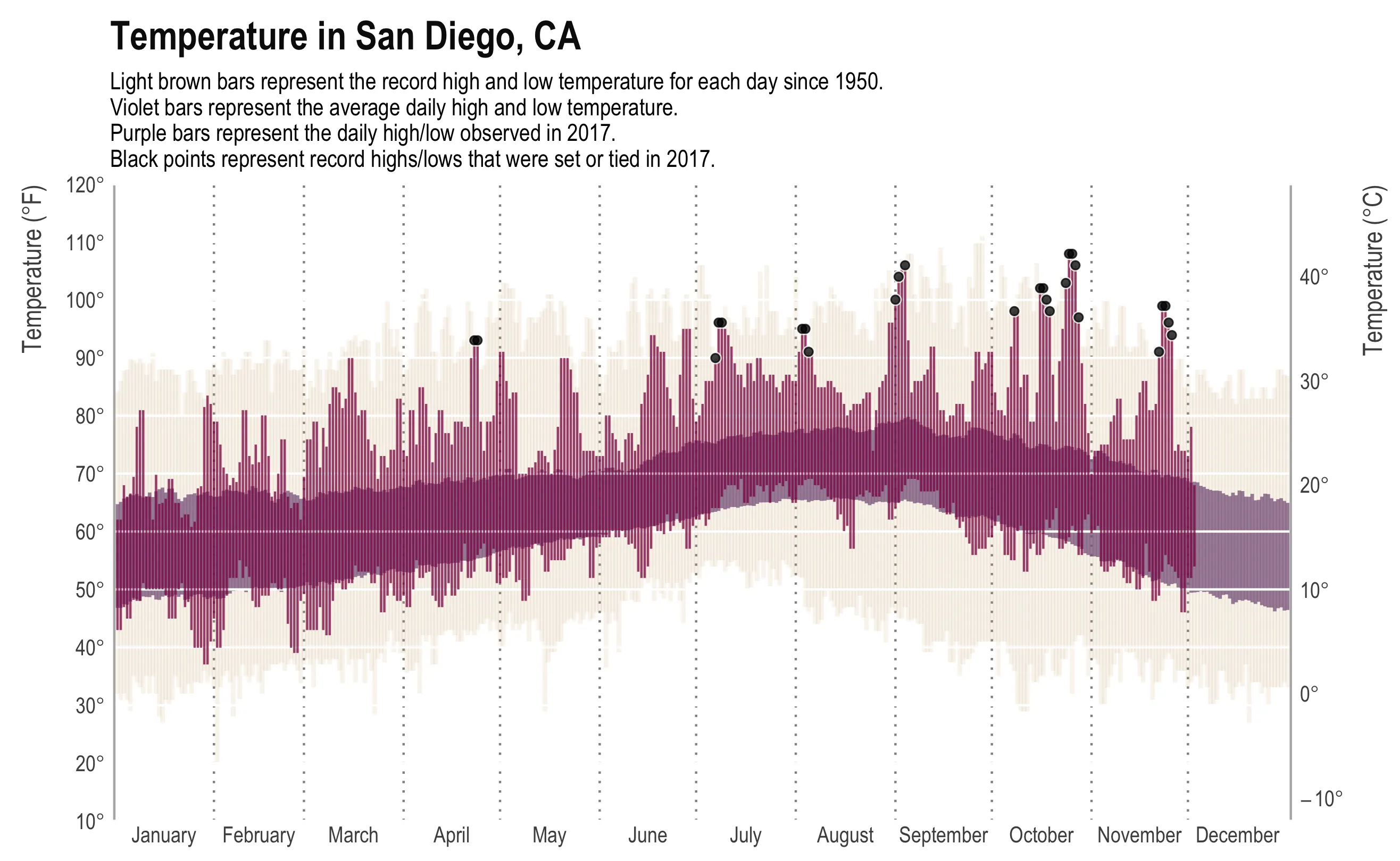
A Tufte-style temperature chart titled Temperature in San Diego, CA, with one vertical bar per day across the year, January to December. A caption above the plot explains the layers: light brown bars are the record high and low for each day since 1950, violet bars the average daily high and low, purple bars the daily high and low observed in 2017, and black points record highs or lows set or tied in 2017. The y-axis is 10 to 120 degrees Fahrenheit on the left and the same scale in Celsius on the right. The violet average band is remarkably narrow and level all year, running roughly 50 to 65 degrees in winter and 65 to 80 in late summer. About twenty black points sit along the top, clustered from July to November, several above 100 degrees — a lot of record highs for one year. Almost none sit at the bottom.

I am taking a break from a crazy couple months of writing and coding by… writing code. Just a quick post comparing weather in Boston (where I am) to weather in San Diego (where I’m from).

While the New York Times may have made the original, most data viz people will recognize the plot above from Tufte’s classic, Visual Display of Quantitative Information. It presents a ton of data in a clear, concise, and appealing way. The background bars show the record high and low daily temperature, the mid-ground bars show the “normal” (though as far as I can tell, normal is never clearly defined) high and low temperature, and the foreground shows the high and low for that year. In addition, we have annotations for days that met or made the record. The original plot even had a subplot for daily precipitation.

Here is a similar plot for Boston:
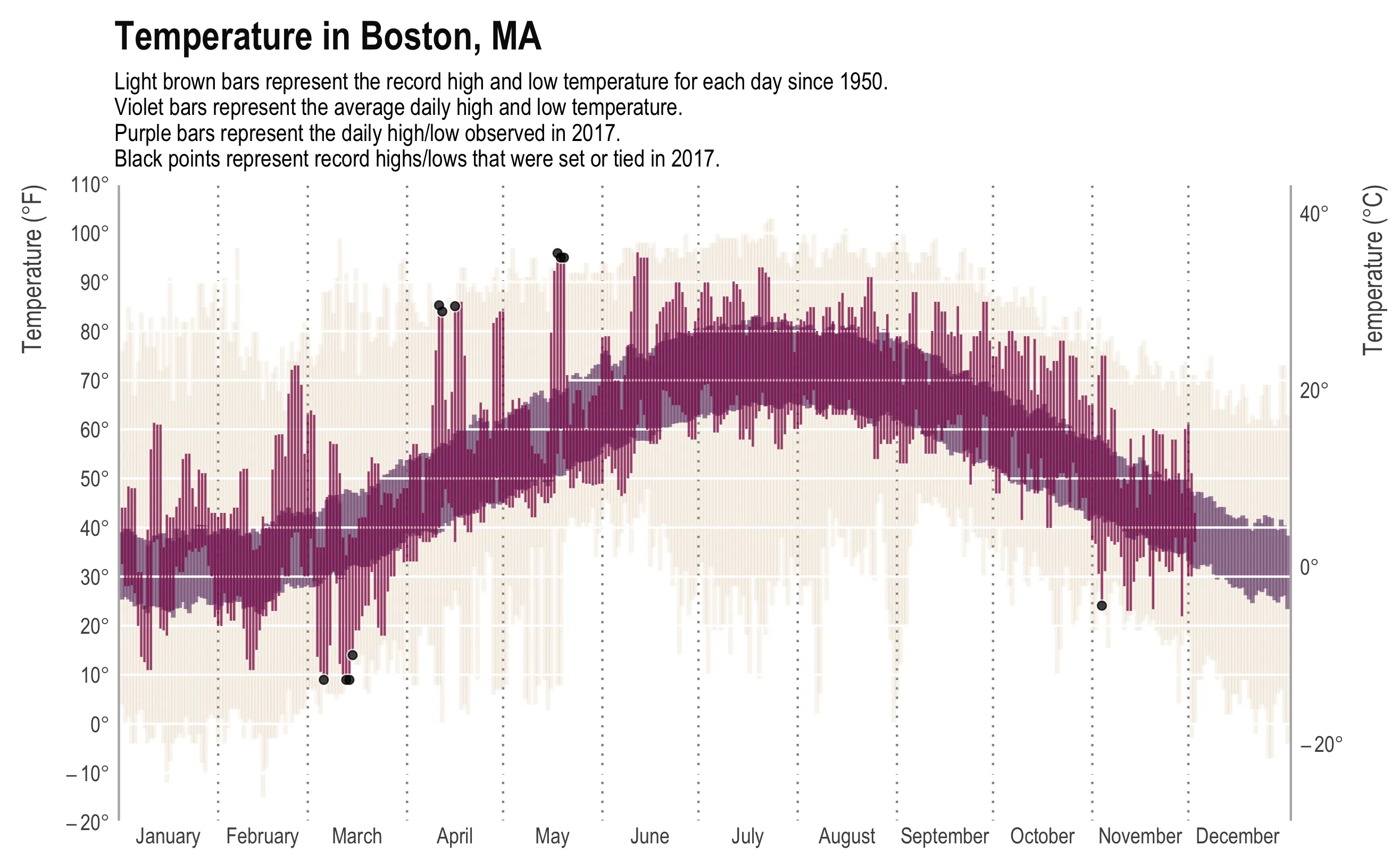
The same Tufte-style chart for Boston, titled Temperature in Boston, MA, one vertical bar per day from January to December. A caption above the plot explains the layers: light brown bars are the record high and low for each day since 1950, violet bars the average daily high and low, purple bars the daily high and low observed in 2017, and black points record highs or lows set or tied in 2017. The y-axis runs -20 to 110 degrees Fahrenheit, a far wider range than the San Diego version. The violet average band sweeps from about 25 to 40 degrees in January up to 65 to 82 in July and back down, and the 2017 purple bars swing wildly around it. Seven black points: three record highs in April and May, three record lows in February and March, and one in November.

From all the dots, you can tell it’s been a hot year in San Diego. Boston, on the other hand, is unsurprisingly variable. The joke around here is if you don’t like the weather, you just need to wait a minute.

How about just average high and lows?

Let’s clear out the unnecessary data and just compare the expected highs and lows:
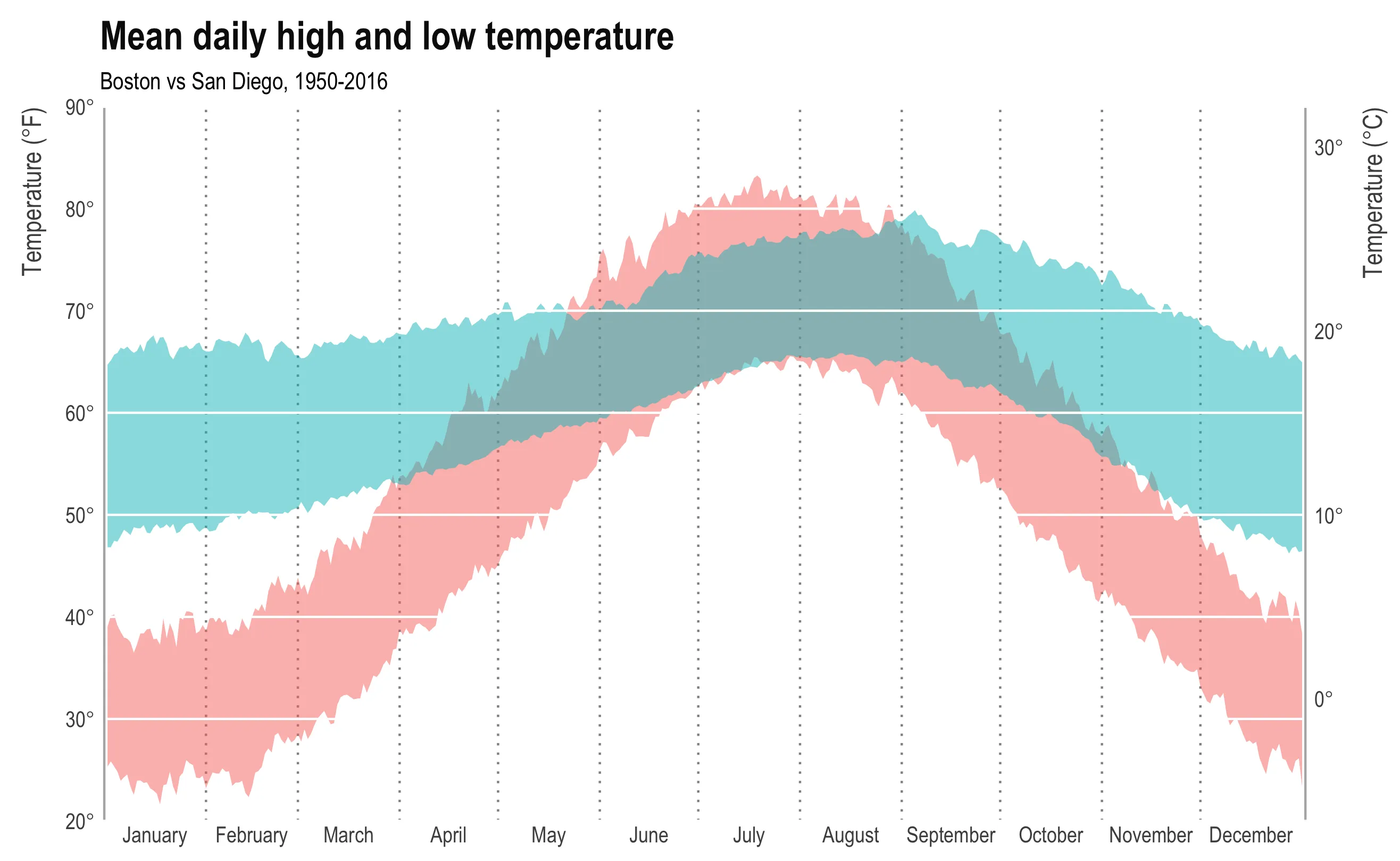
An area chart titled Mean daily high and low temperature, subtitled Boston vs San Diego, 1950 to 2016, with the year January to December across the x-axis and 20 to 90 degrees Fahrenheit up the left side and Celsius on the right. Two shaded bands, and the chart carries no legend. The teal band is San Diego: narrow and nearly level all year, from about 50 to 68 degrees in winter up to 65 to 79 in late summer. The pink band is Boston: from about 25 to 40 degrees in January it climbs to 65 to 82 in July and falls back to 25 to 40 by late December. The two overlap only from about June to September.

It’s not a competition, but if it were, San Diego would win. I didn’t bother putting a legend on here because… Boston.

How about rain and snow?

Let’s compare cumulative precipitation:
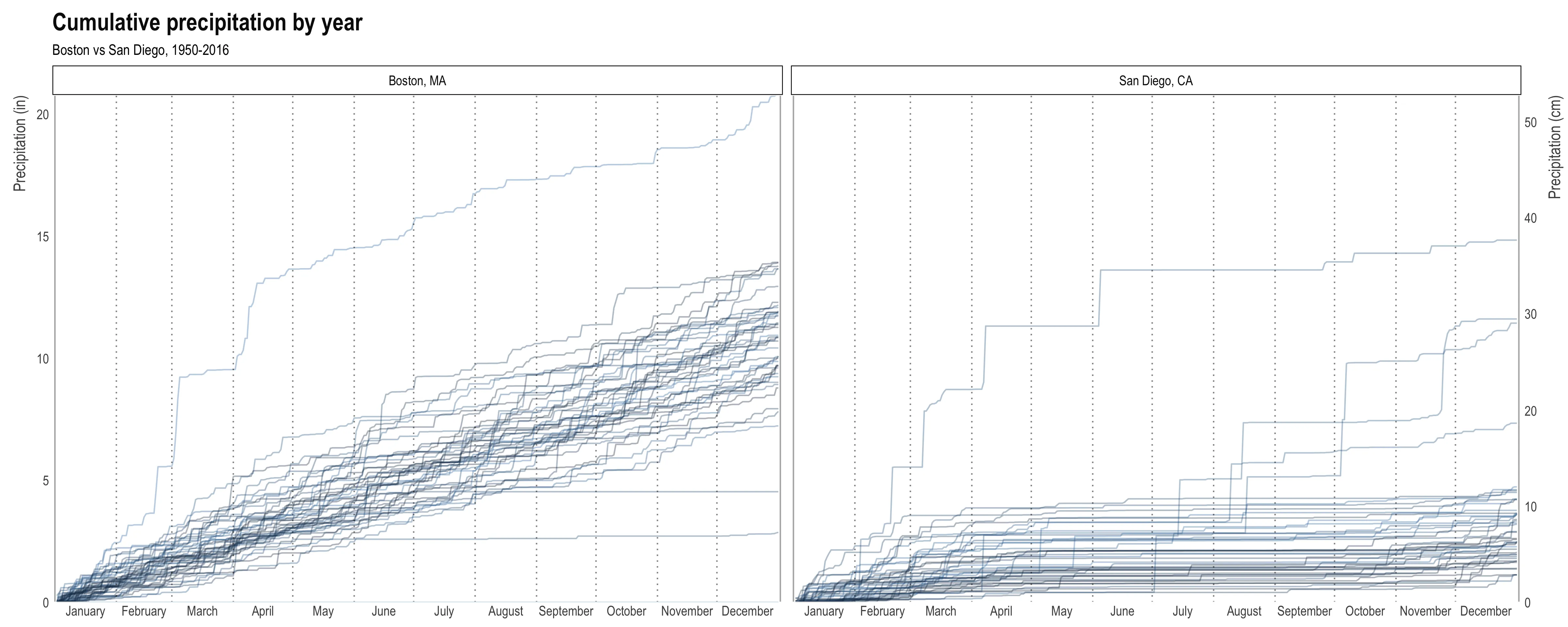
Two panels titled Cumulative precipitation by year, subtitled Boston vs San Diego, 1950 to 2016, with Boston, MA on the left and San Diego, CA on the right and a shared y-axis of 0 to 21 inches, also shown in centimetres. Each panel holds one line per year, running January to December, darker for more recent years. Boston's lines climb steadily and almost straight all year, most ending between 8 and 14 inches and one above 20. San Diego's lines rise in a few sharp steps between January and March, then flatten almost completely from April onward; most end between 3 and 11 inches, with a handful of wet years reaching 15.

Each line is one year. Darker colors are more recent years.

+1 San Diego.

Worse part of Boston weather:

Despite the rain/snow and the crazy annual temperature range, what bothers me most about Boston weather is the insane daily variability. Below is a plot of daily temperature change for all 50 years. Again, each line is a year and darker lines are more recent years.
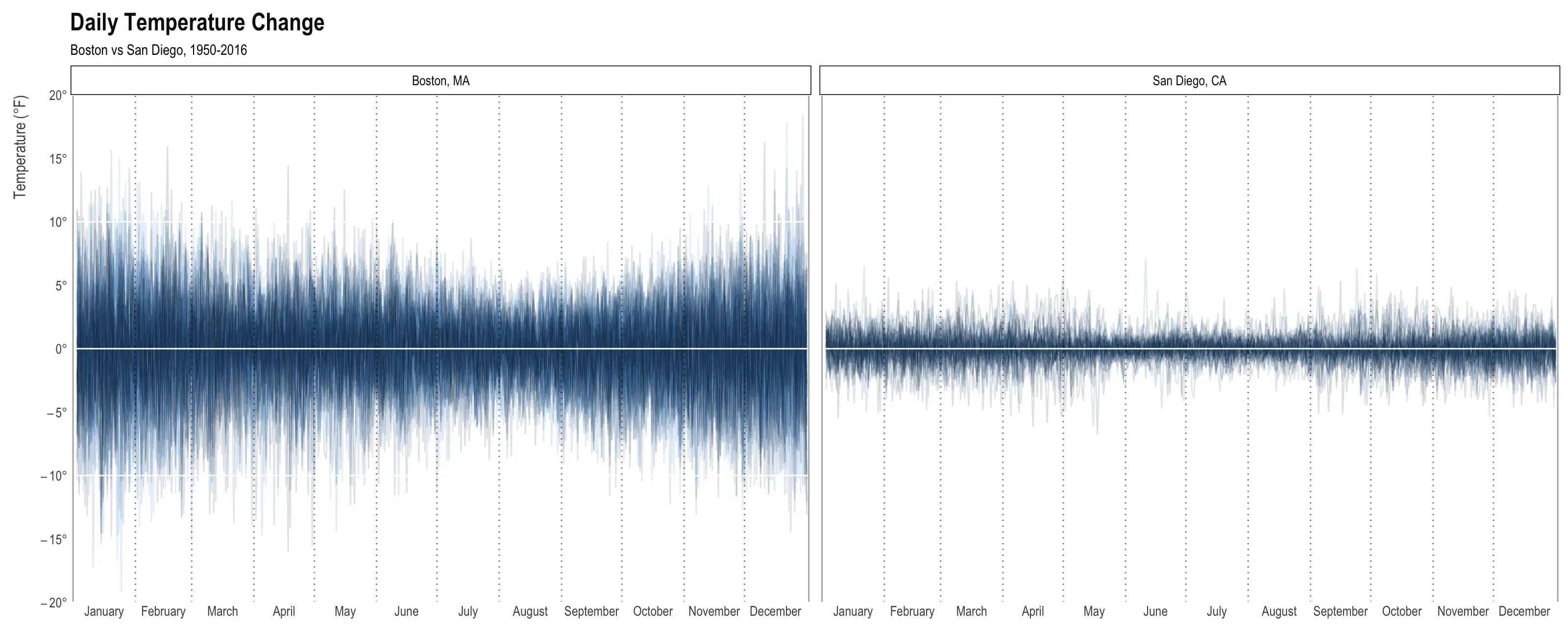
Two panels titled Daily Temperature Change, subtitled Boston vs San Diego, 1950 to 2016, with Boston, MA on the left and San Diego, CA on the right and a shared y-axis of -20 to 20 degrees Fahrenheit. One line per year, drawn as a dense band of spikes above and below zero. Boston's band fills most of the height, routinely reaching plus or minus 10 degrees and occasionally past plus or minus 15, and it is widest from November through May. San Diego's band is a fraction of that height, mostly within plus or minus 3 degrees and rarely past 5, and about as narrow in winter as in summer.

+1 San Diego.

Conclusion

San Diego has better weather than Boston.

The full code is at this gist.