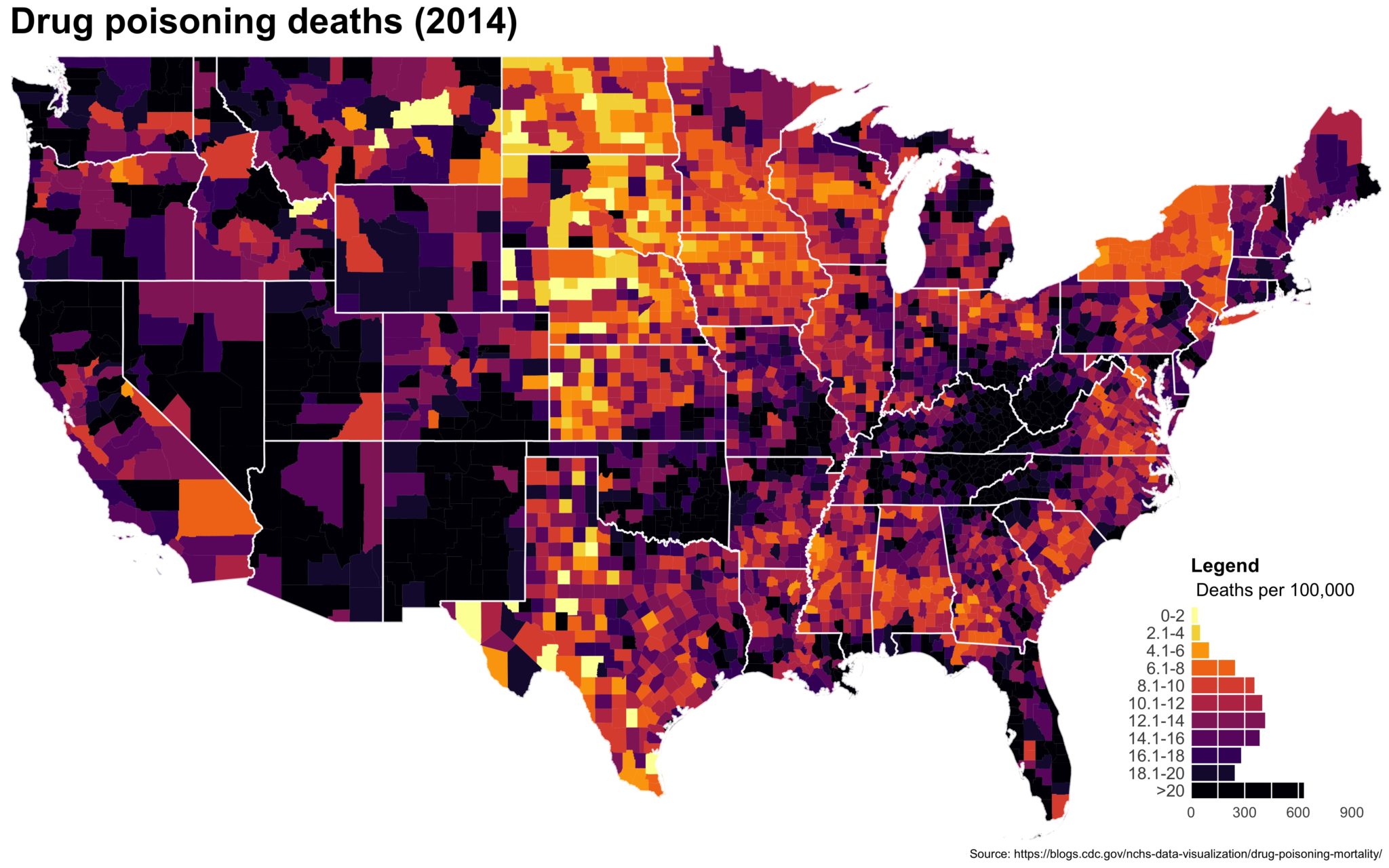
 Despite well known drawbacks,1 plotting parameters onto maps provides a convenient way of seeing context, patterns, and outliers. However, one of the many problems with choropleths is that the area of the regions tend to distort our perception of the value of the region. For example, in the United States, huge (in terms of land mass) counties will tend to have a greater visual impact than small counties (despite often having similar or even smaller population sizes).
One way to address this is to use a histogram as a legend on your map. The histogram then provides you with a way of showing raw counts of equal weights while the map allows you to provide the spatial context of the values.