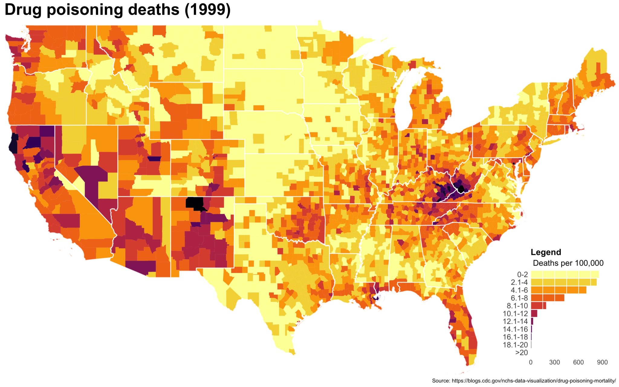
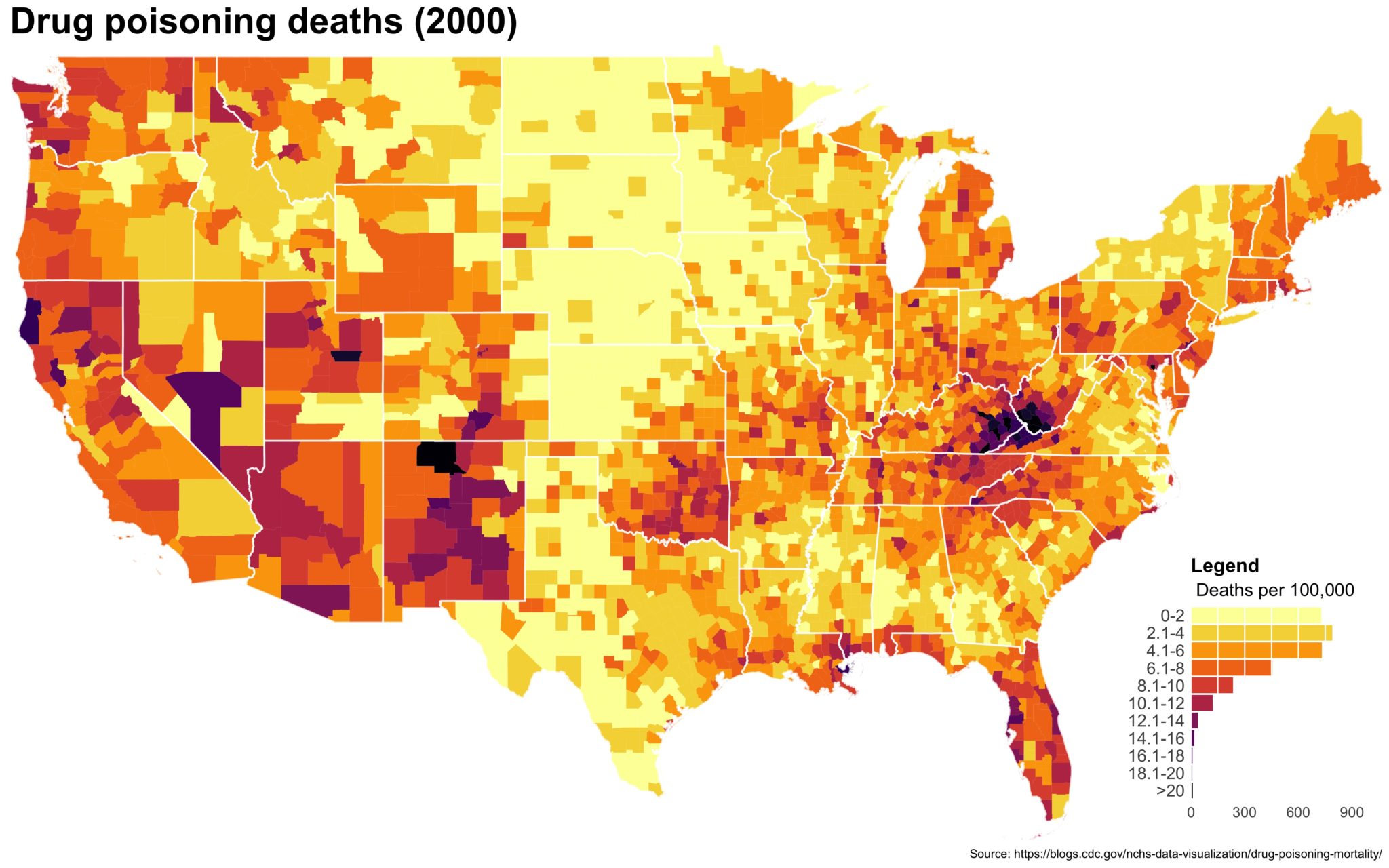
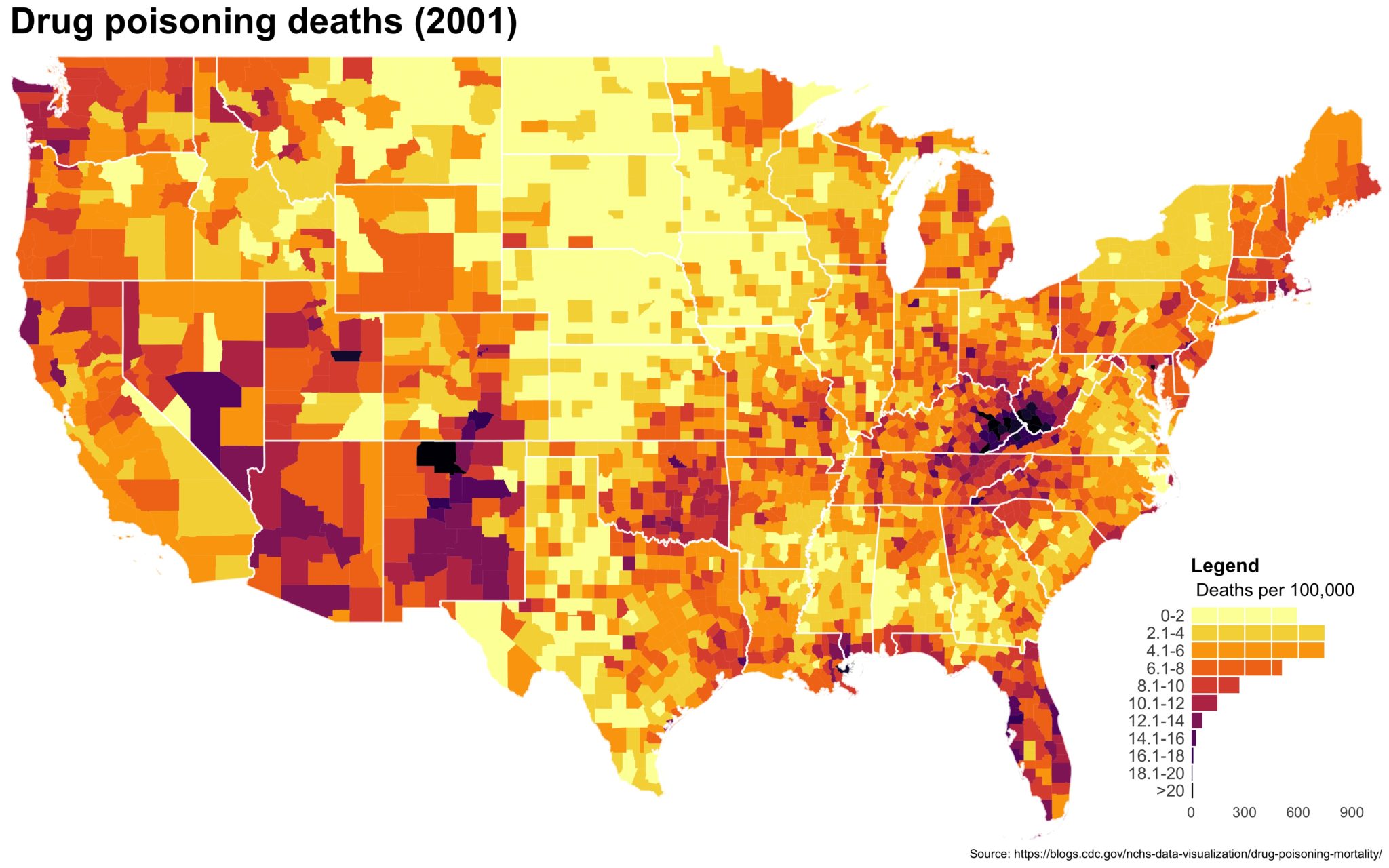
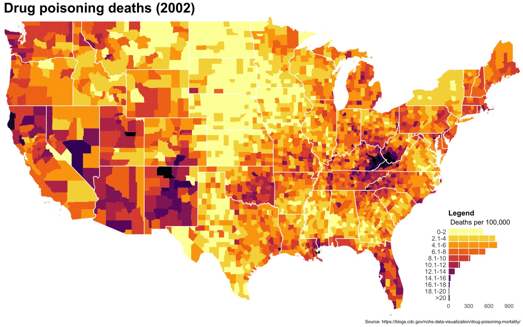
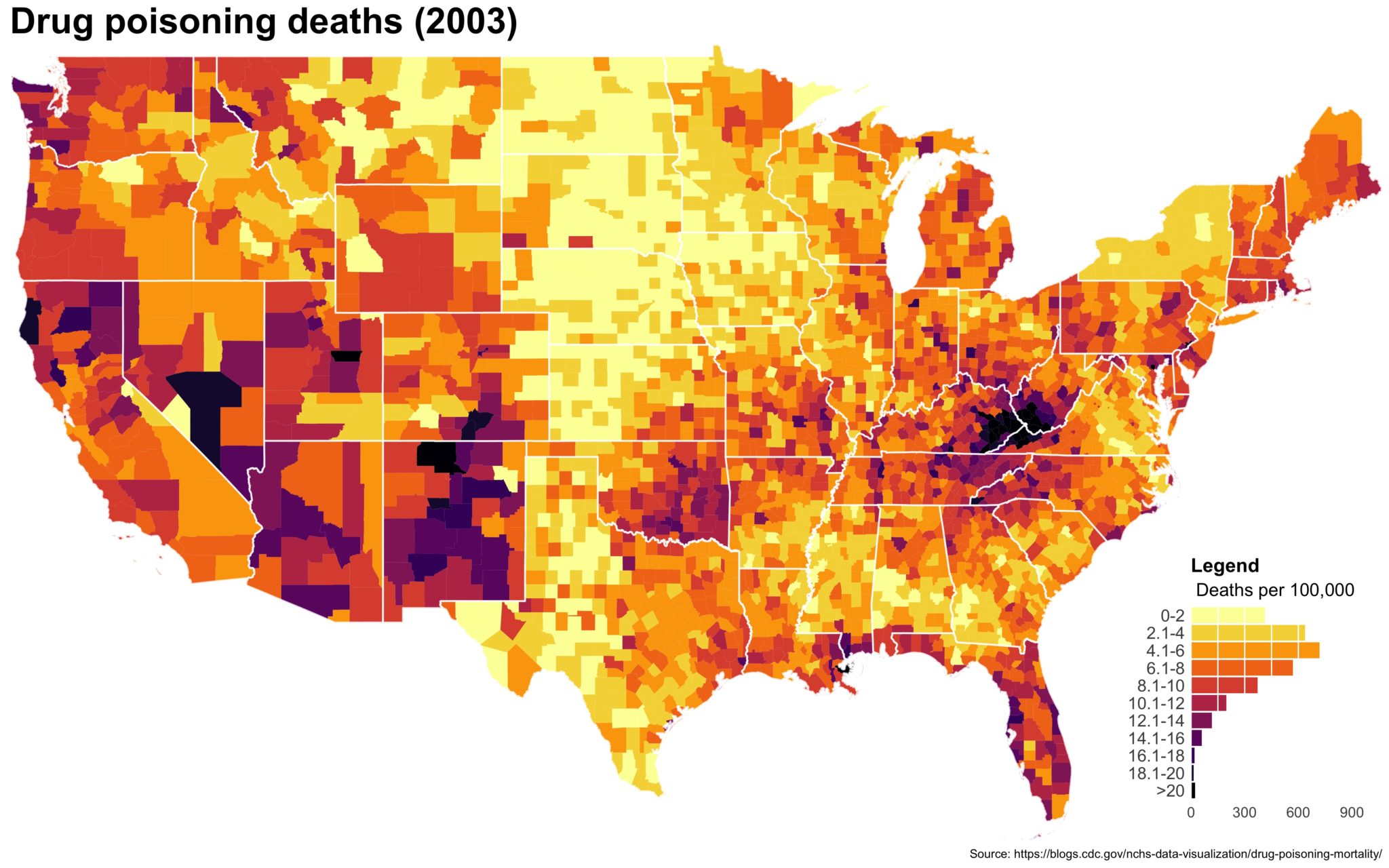
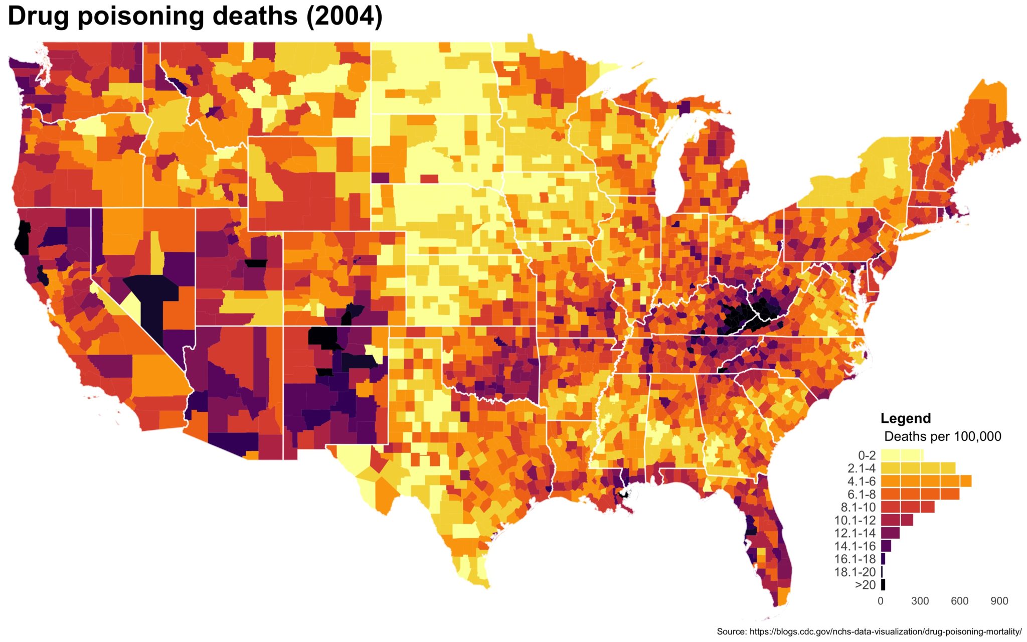
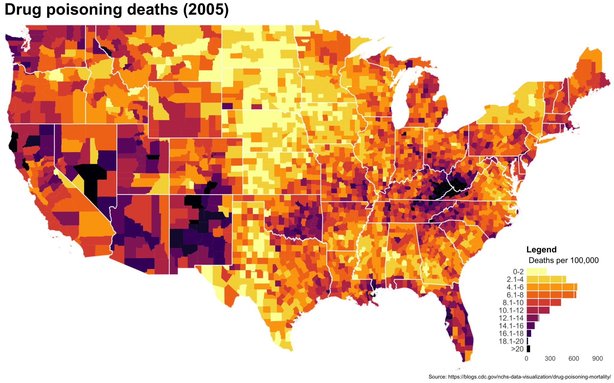
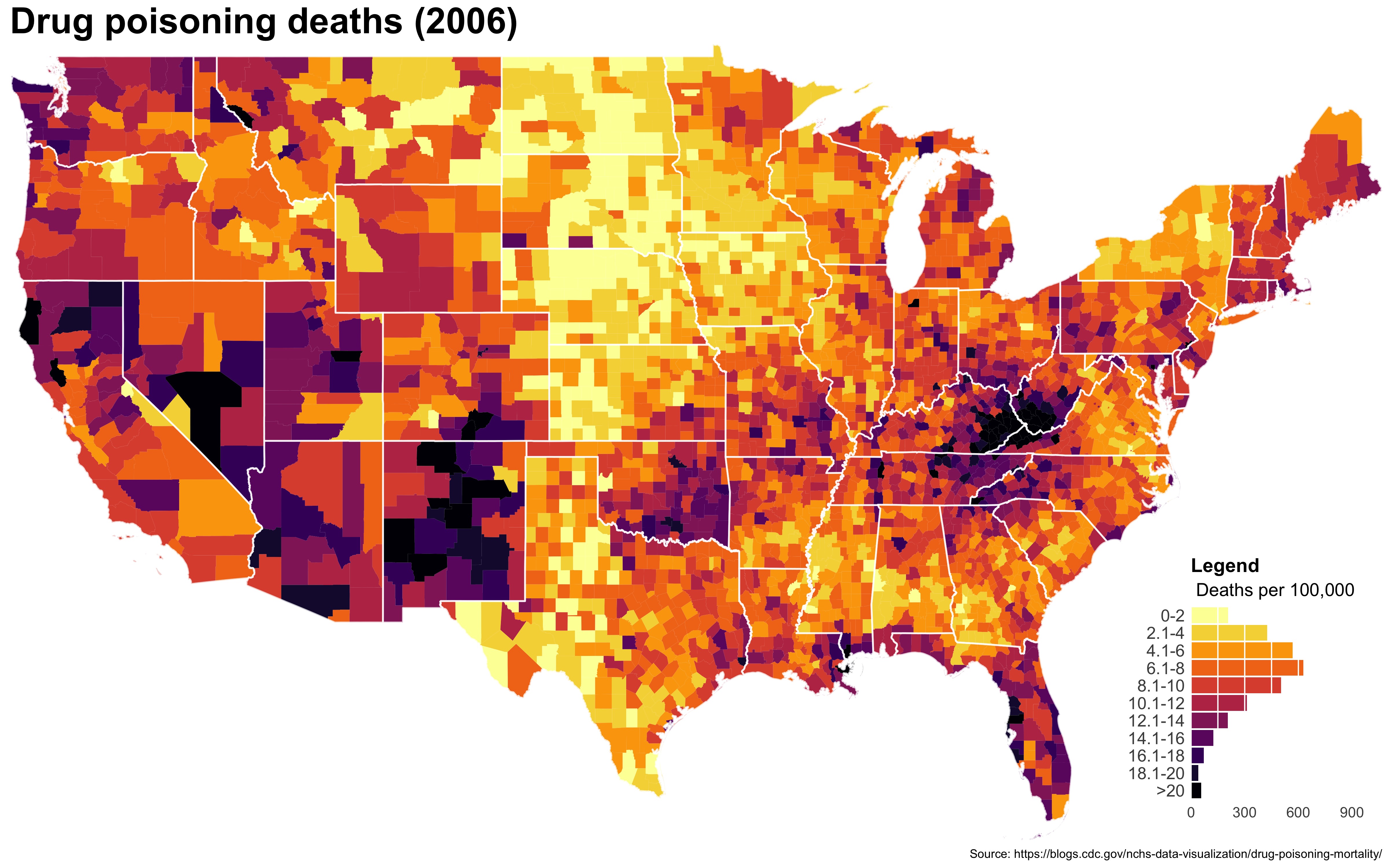
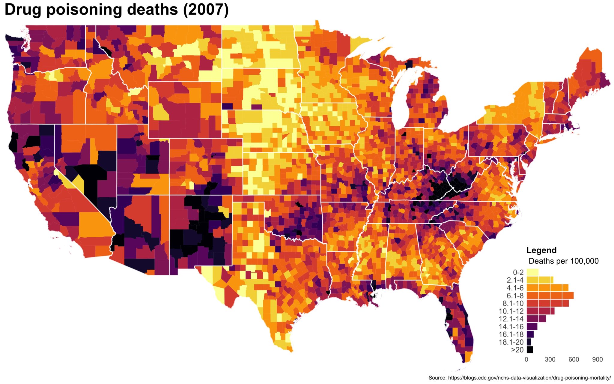
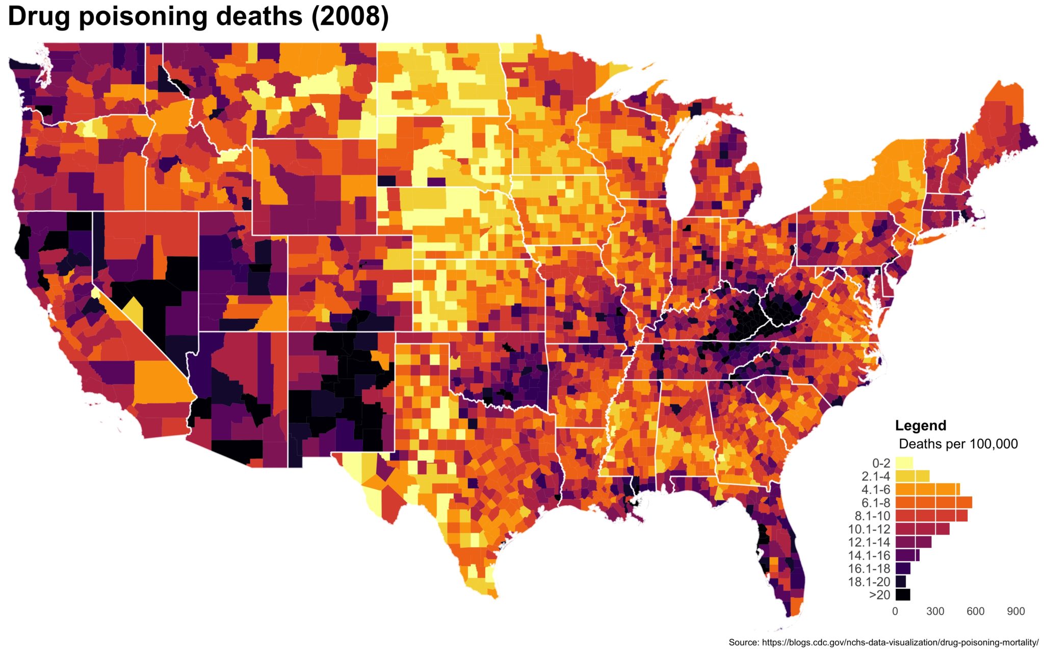
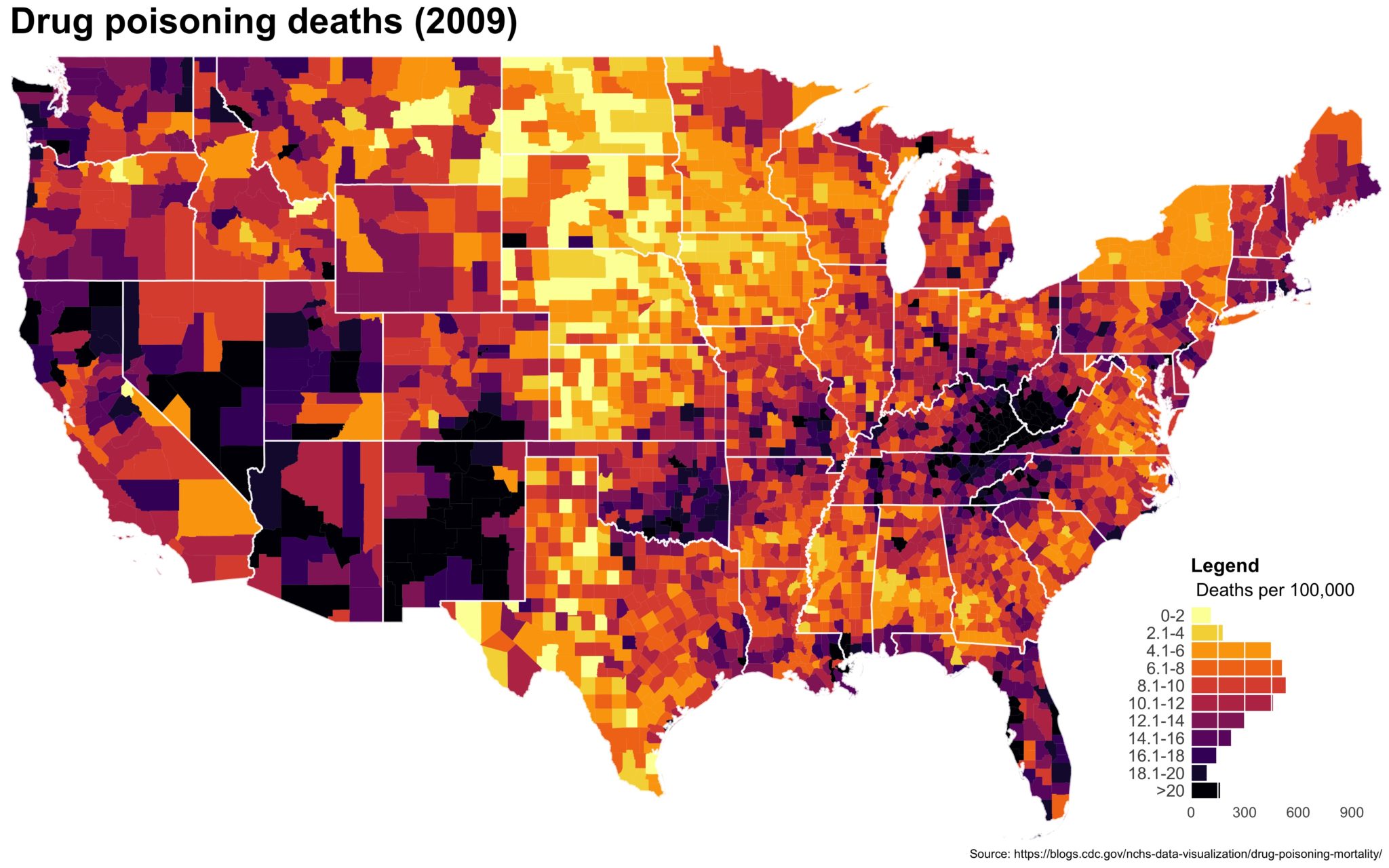
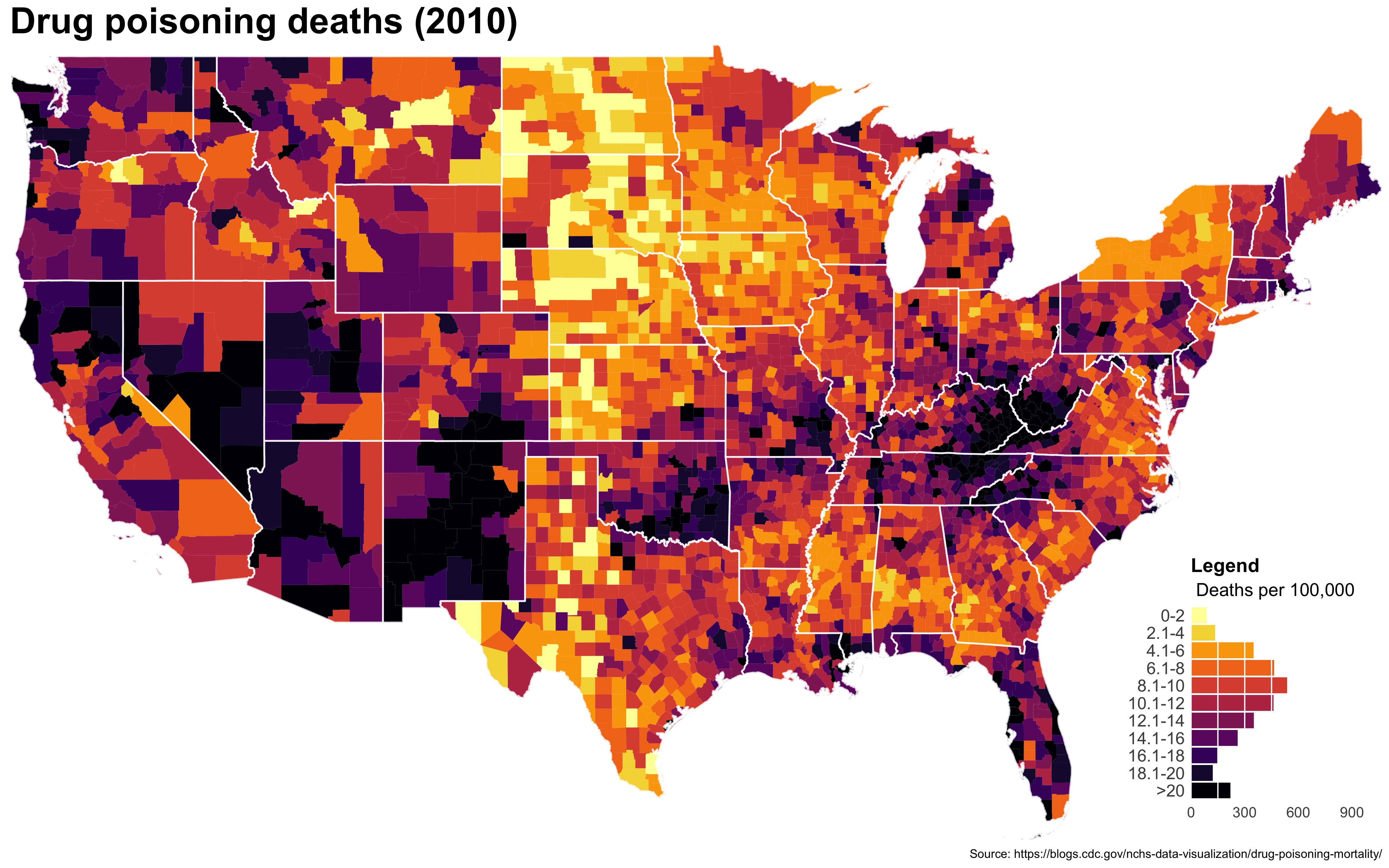
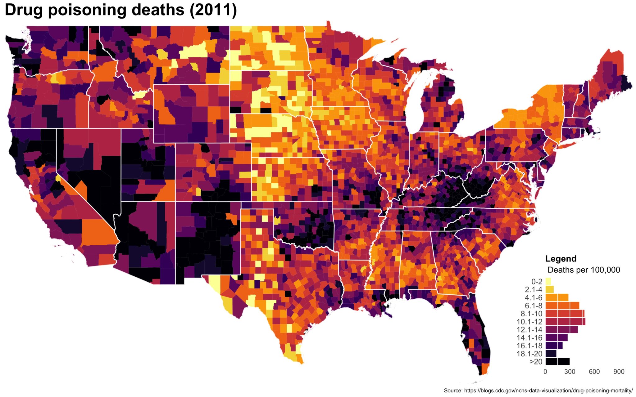
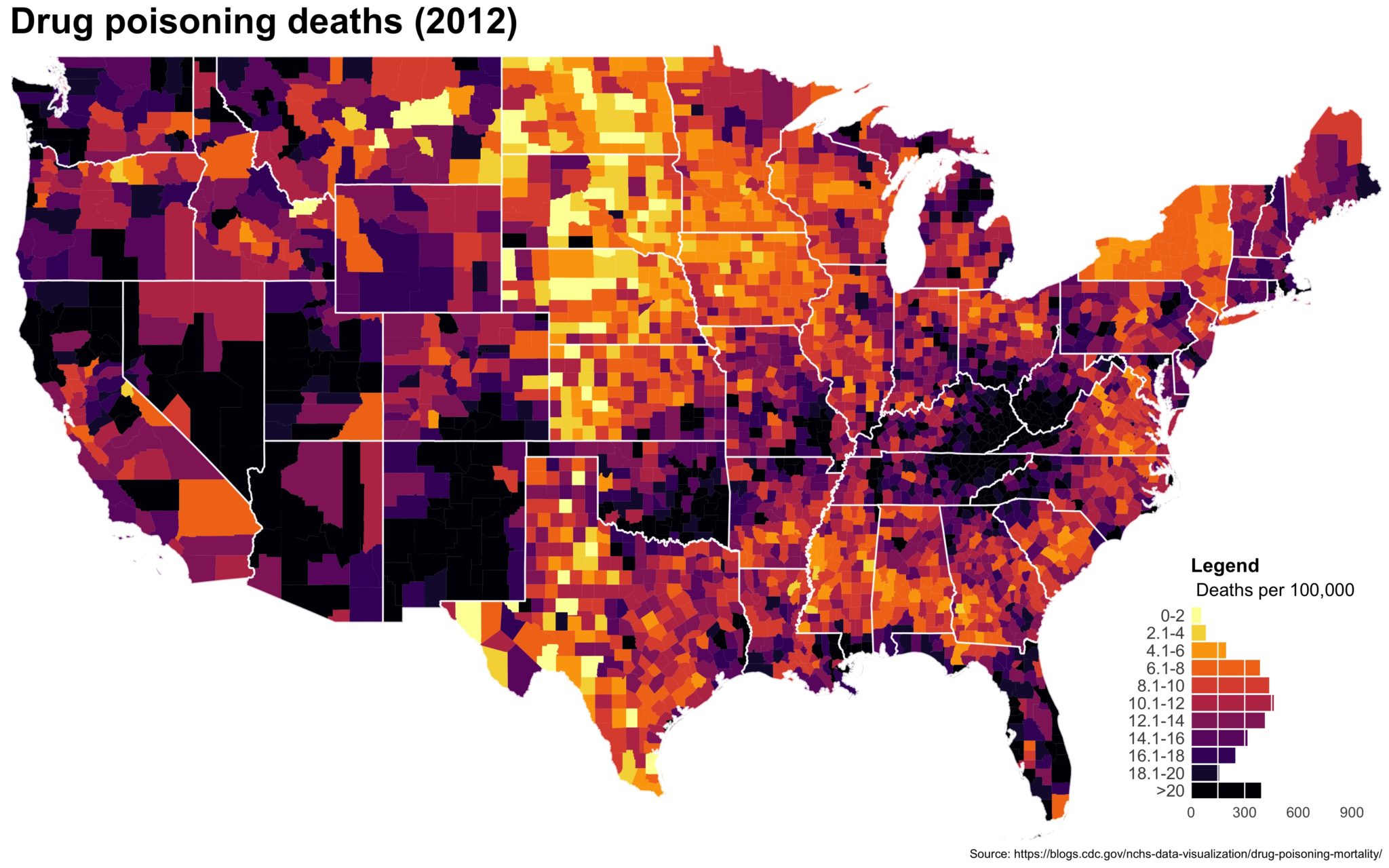
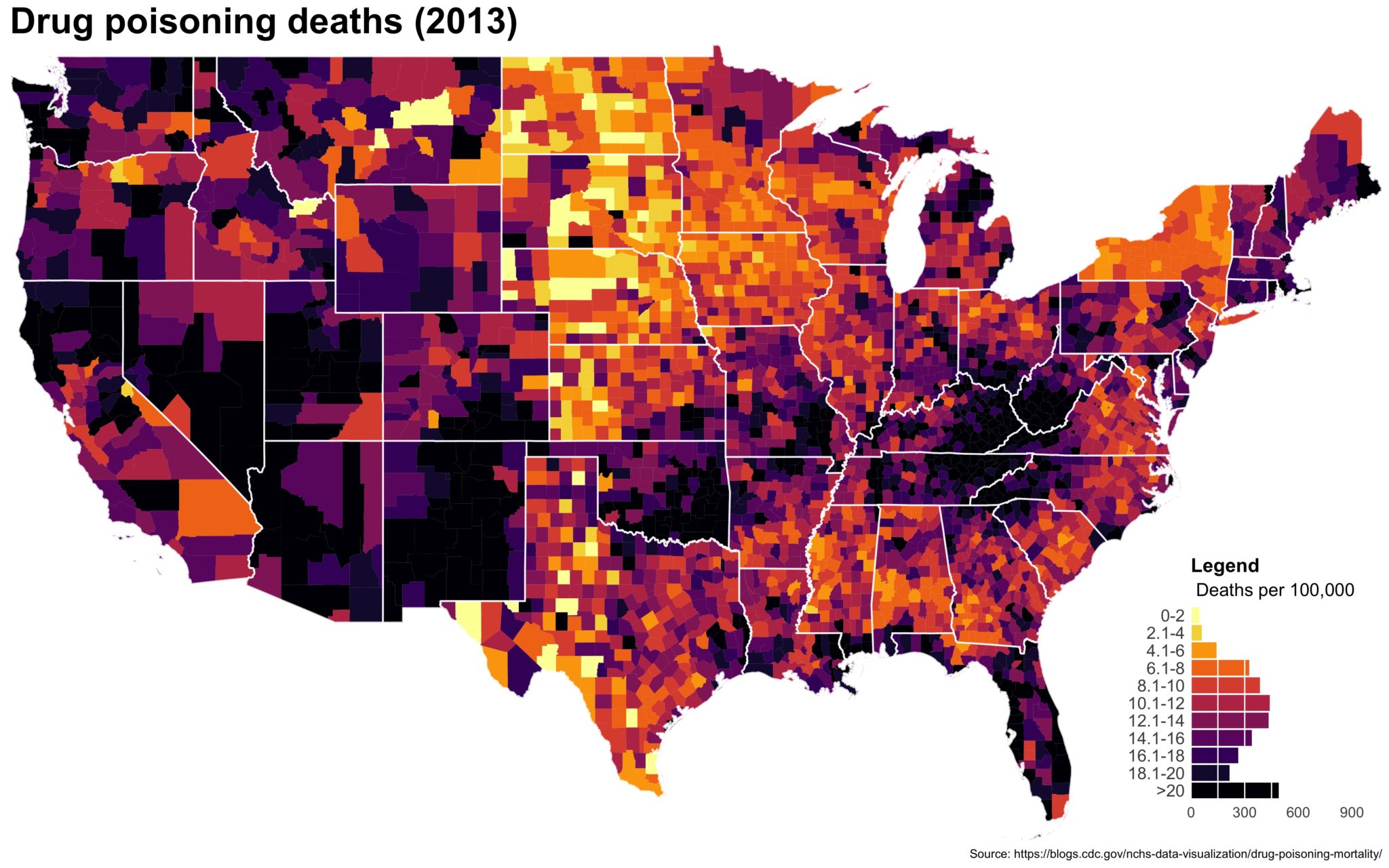
 Despite well known drawbacks,1 plotting parameters onto maps provides a convenient way of seeing context, patterns, and outliers. However, one of the many problems with choropleths is that the area of the regions tend to distort our perception of the value of the region. For example, in the United States, huge (in terms of land mass) counties will tend to have a greater visual impact than small counties (despite often having similar or even smaller population sizes).
One way to address this is to use a histogram as a legend on your map. The histogram then provides you with a way of showing raw counts of equal weights while the map allows you to provide the spatial context of the values.
If you know how to make a choropleth already and just want the to know how to add the histogram, scroll to the bottom. Otherwise, we’re going to make the map above from scratch.
1. Get, load, and prep the data
You can download the drug deaths data from the CDC blog post here. We will need two shape files — the 2013 county CB shape file and the 2013 state CB shape file.
## Download the drug death data from:
## https://blogs.cdc.gov/nchs-data-visualization/drug-poisoning-mortality/
##
## Download the 2013 CB shapefiles (500k will do) for counties and states:
## https://www.census.gov/geo/maps-data/data/cbf/cbf_counties.html
## https://www.census.gov/geo/maps-data/data/cbf/cbf_state.html

## Imports ----
library(tidyverse)
library(broom)
library(rgdal)
library(viridis)
library(grid)

## Lower 48 states ----
lower_48 <-  c("09", "23", "25", "33", "44", "50", "34", "36", "42", "18",
               "17", "26", "39", "55", "19", "20", "27", "29", "31", "38",
               "46", "10", "11", "12", "13", "24", "37", "45", "51", "54",
               "01", "21", "28", "47", "05", "22", "40", "48", "04", "08",
               "16", "35", "30", "49", "32", "56", "06", "41", "53")


## Load drug poisoning data ----
county_df <- read_csv(paste0('./../original_data/NCHS_-_Drug_' ,
                             'Poisoning_Mortality__County_Trends',
                             '__United_States__1999_2014.csv'),
                      col_names = c('fipschar', 'year', 'state', 'st',
                                    'stfips', 'county', 'pop', 'smr'),
                      skip = 1)
county_df$smr <- factor(county_df$smr,
                        levels = unique(county_df$smr)[c(10, 1:9, 11)],
                        ordered = TRUE)


##  Import US states and counties from 2013 CB shapefile ----
##  We could use map_data() -- but want this to be generalizable to all shp.
allcounties <- readOGR(dsn = "./../shapefiles/",
                       layer = "cb_2013_us_county_500k")
allstates   <- readOGR(dsn = "./../shapefiles/",
                       layer = "cb_2013_us_state_500k")


## A little munging and subsetting for maps ----
allcounties@data$fipschar <- as.character(allcounties@data$GEOID)
allcounties@data$state <- as.character(allcounties@data$STATEFP)
allstates@data$state <- as.character(allstates@data$STATEFP)

## Only use lower 48 states
subcounties <- subset(allcounties, allcounties@data$state %in% lower_48)
substates <- subset(allstates, allstates@data$state %in% lower_48)

## Fortify into dataframes
subcounties_df <- tidy(subcounties, region = "GEOID")
substates_df <- tidy(substates, region = "GEOID")
The code is pretty straightforward. We are just loading up the data and doing some minor tweaks like changing the levels of the death rates so they are in order. The tidy() command is just the new version of fortify() which changes spatial data into a dataframe that ggplot2 can read and use.2
2. Make a basic map
Let’s subset to a single year and make a map. Back in my day you had to do a double merge to get the data in order and for counties (or even worse, census tracts), it could take forever. Now, we can use geom_map() though it still appears to take forever.
## Let's focus on one year and do a practice run
df_2014 <- filter(county_df, year == 2014)

map_2014 <- ggplot(data = df_2014) +
    geom_map(aes(map_id = fipschar, fill = smr), map = subcounties_df)  +
    expand_limits(x = subcounties_df$long, y = subcounties_df$lat)
ggsave(map_2014, file = './first_pass.jpg', width = 5, height = 3.5)
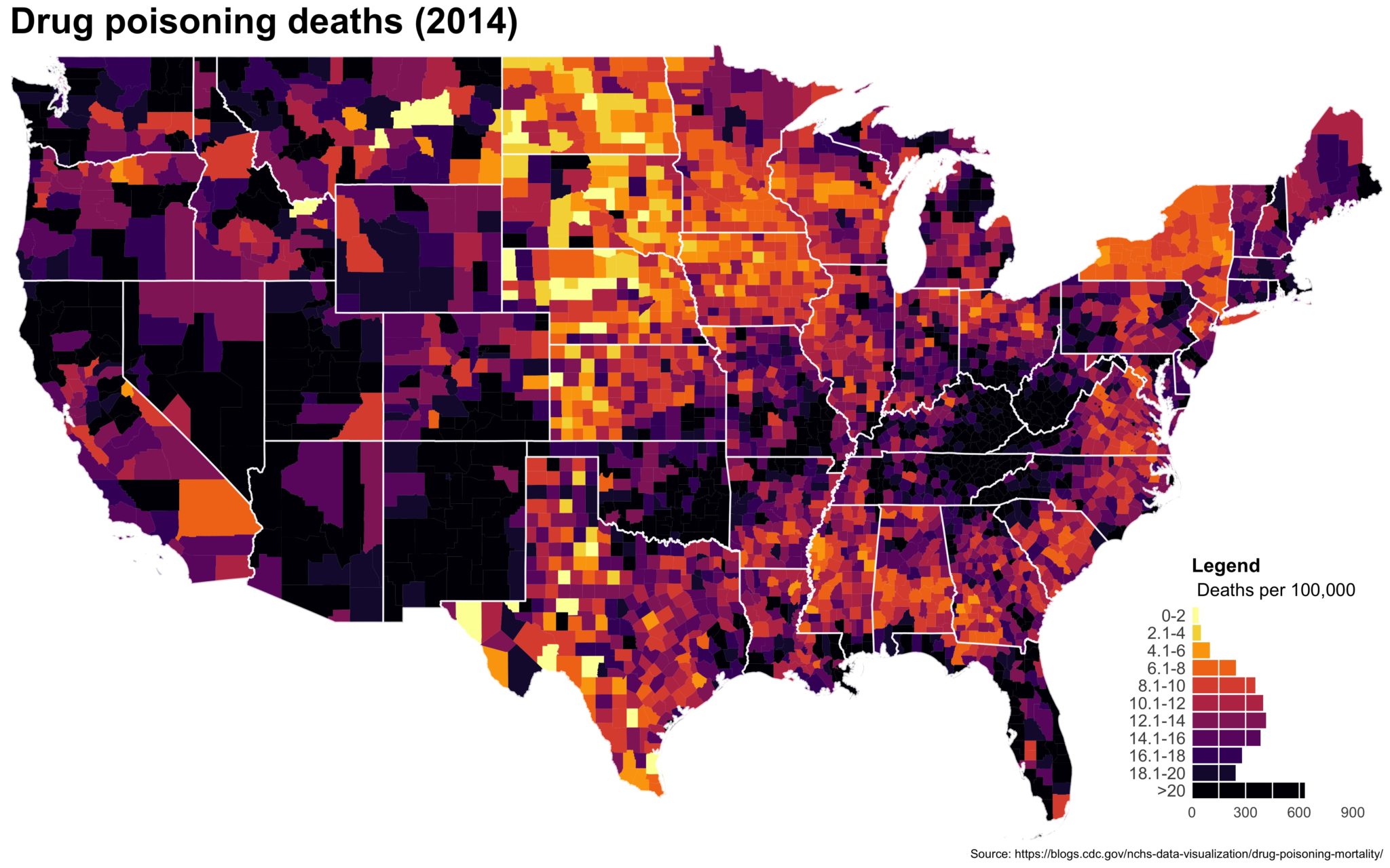
You end up with something like this:
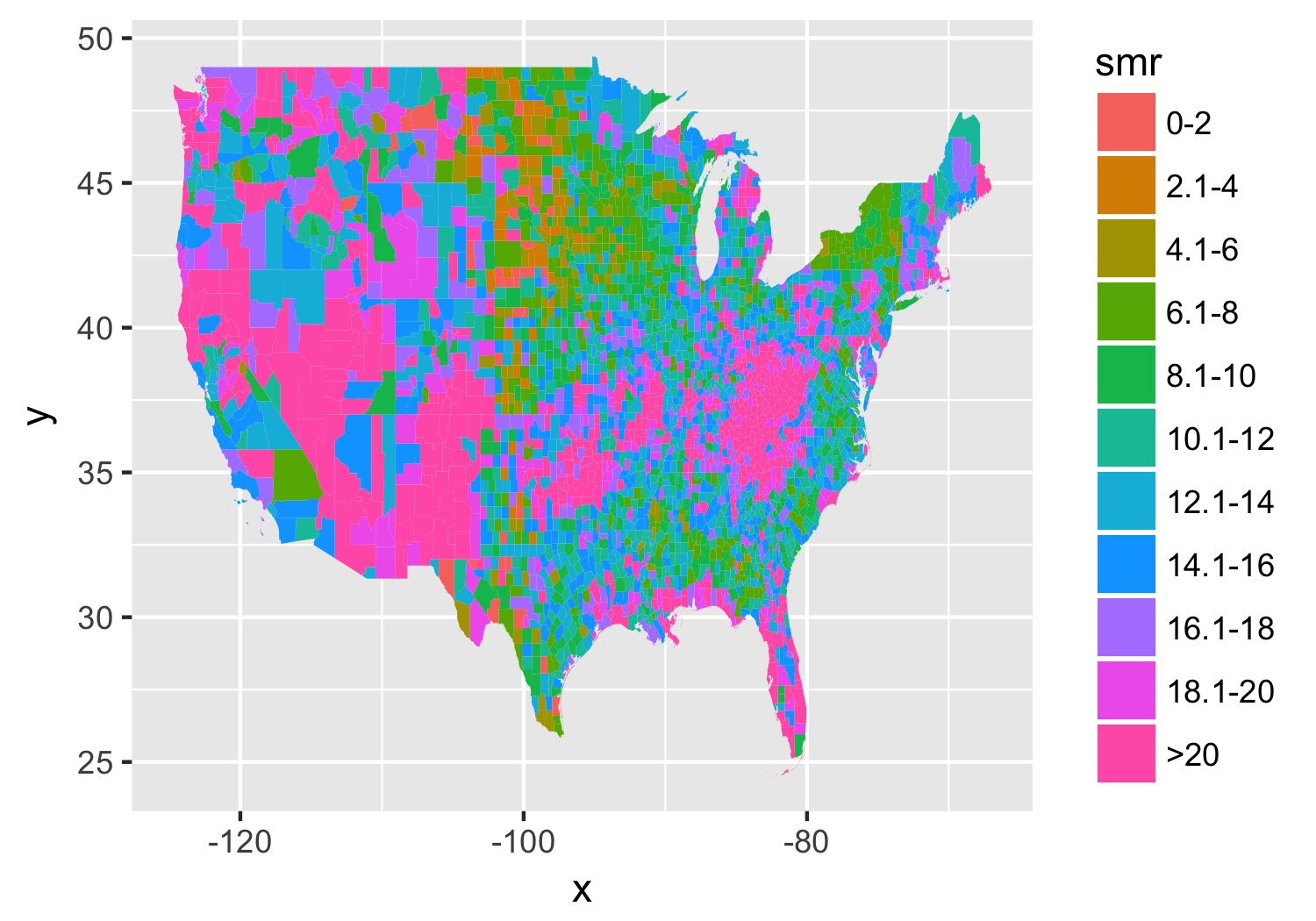
It’s… well it’s a map and, quite frankly, not the ugliest map I’ve ever made.
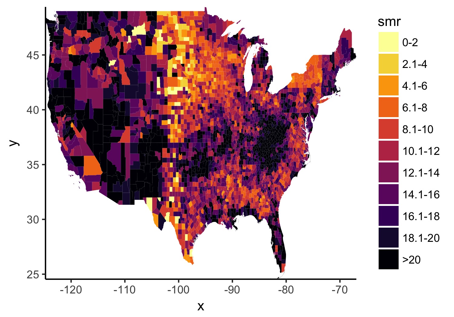
2b. Better colors, less empty space, and better base theme.
I prefer theme_classic() as my base since it gets rid of most of the things I don’t want anyways. And I often waffle between ColorBrewer and Viridis, but let’s go with viridis here.
map_2014 <- map_2014 +
    theme_classic() +
    scale_fill_viridis(option = "inferno", discrete = TRUE, direction = -1) +
    scale_x_continuous(expand = c(0, 0)) +
    scale_y_continuous(expand = c(0, 0))
ggsave(map_2014, file = './better_colors.jpg', width = 5, height = 3.5)
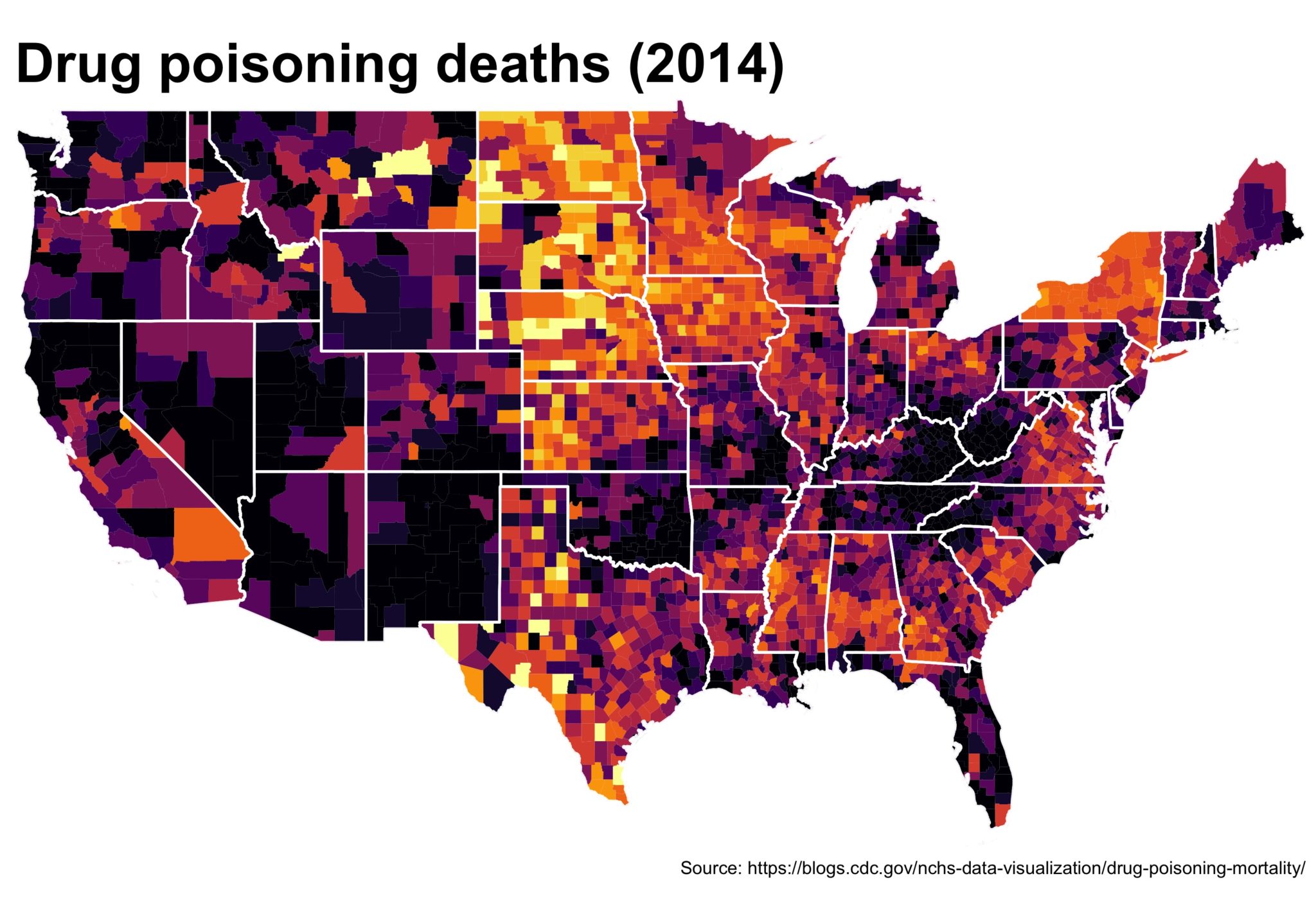
2c. Remove lines we don’t need. Add state lines. Put in some useful text.
Now we’ll use the state CB file (you didn’t forget about it, did you?) to add in state lines. Helpful for providing more context in the US. I also think the title font is too small by default so we’ll make it bigger and we’ll source the original data. Also, I find a 1.35 ratio to be the most pleasing for the US maps in ggplot2 so I set the coord_fixed() to that, but not everybody likes it. Lastly, because of the larger font, we’ll need a bigger scaling factor on the ggsave().
map_2014 <- map_2014 +
    geom_path(data = substates_df, aes(long, lat, group = group),
          color = "white", size = .7, alpha = .75) +
    theme(plot.title = element_text(size = 30, face = "bold"),
          axis.line = element_blank(),
          axis.text.x = element_blank(),
          axis.text.y = element_blank(),
          axis.ticks = element_blank(),
          axis.title.x = element_blank(),
          axis.title.y = element_blank(),
          legend.position = "none") +
    labs(title = "Drug poisoning deaths (2014)",
         caption = paste0('Source: https://blogs.cdc.gov/',
                          'nchs-data-visualization/',
                          'drug-poisoning-mortality/')) +
    coord_fixed(ratio = 1.35)
ggsave(map_2014, file = './getting_closer.jpg', width = 5, height = 3.5,
       scale = 2)
3. First pass on the legend
Now, let’s work on the legend. Instead of using geom_hist(), we’re going to use geom_bar() so we need to aggreagate the data and get the number of counties for each level of drug death rate. Then, just call it like any normal bar plot, but with stat = 'identity' and fill in the color scheme we’ve already decided on to match the map.
##  First, aggregate the data
agg_2014 <- df_2014 %>%
    group_by(smr) %>%
    summarize(n_county = n())

## Legend, first pass ----
legend_plot <- ggplot(data = agg_2014,
                      aes(y = n_county, x = smr, fill = smr)) +
    geom_bar(stat = 'identity') +
    scale_fill_viridis(option = "inferno", discrete = TRUE, direction = -1)
ggsave(legend_plot, file = './legend_first.jpg',
       height = 2, width = 1.75, scale = 3)
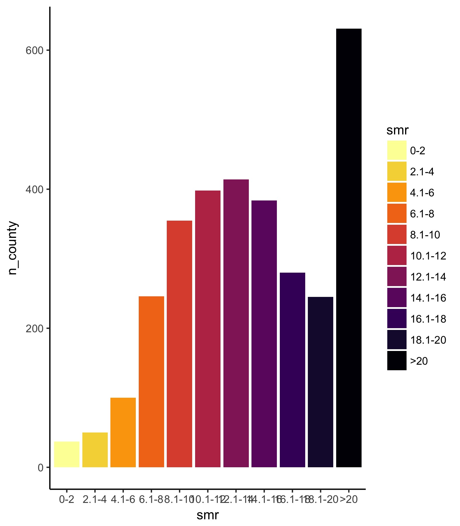
Ok. So the legend can use some work. The first thing is that we need to fix the y-axis so that it is consistent across all years. Just looking for the maximum value shows us [0, 900] is a good range. Next, we need to flip the coordinates so the bars are horizontal — however, if we do that, the black bar will be on top and the yellow on the bottom so we also need to flip the order of the factors so that they match the legend.
3b. Let’s reverse the order of the factors and then flip coordinates.
legend_plot <- legend_plot +
    scale_y_continuous("", expand = c(0, 0), breaks = seq(0, 900, 300),
                       limits = c(0, 900)) +
    scale_x_discrete(limits = rev(levels(df_2014$smr))) +
    coord_flip()
ggsave(legend_plot, file = './proper_orientation.jpg',
       height = 2, width = 1.75, scale = 3)
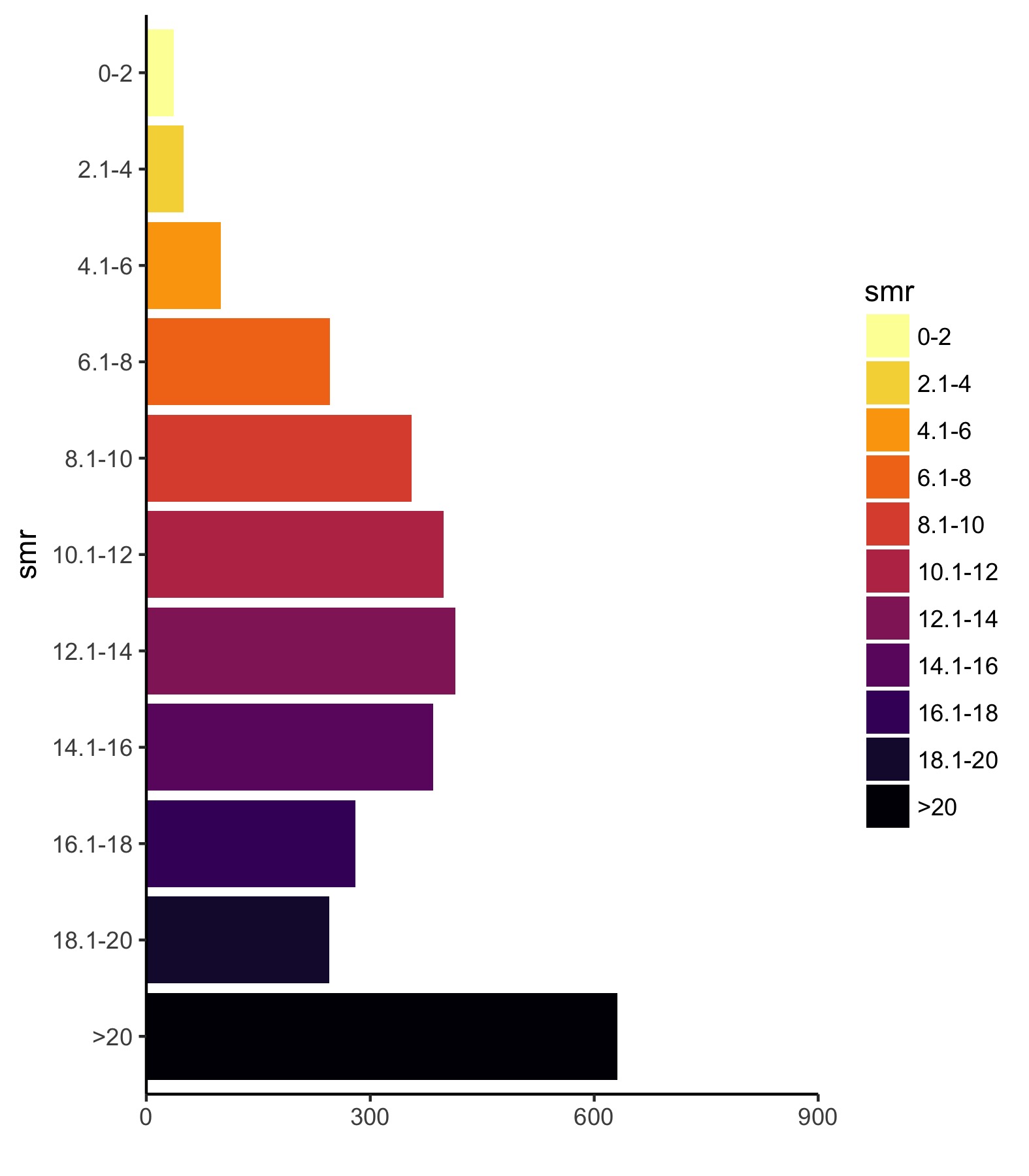
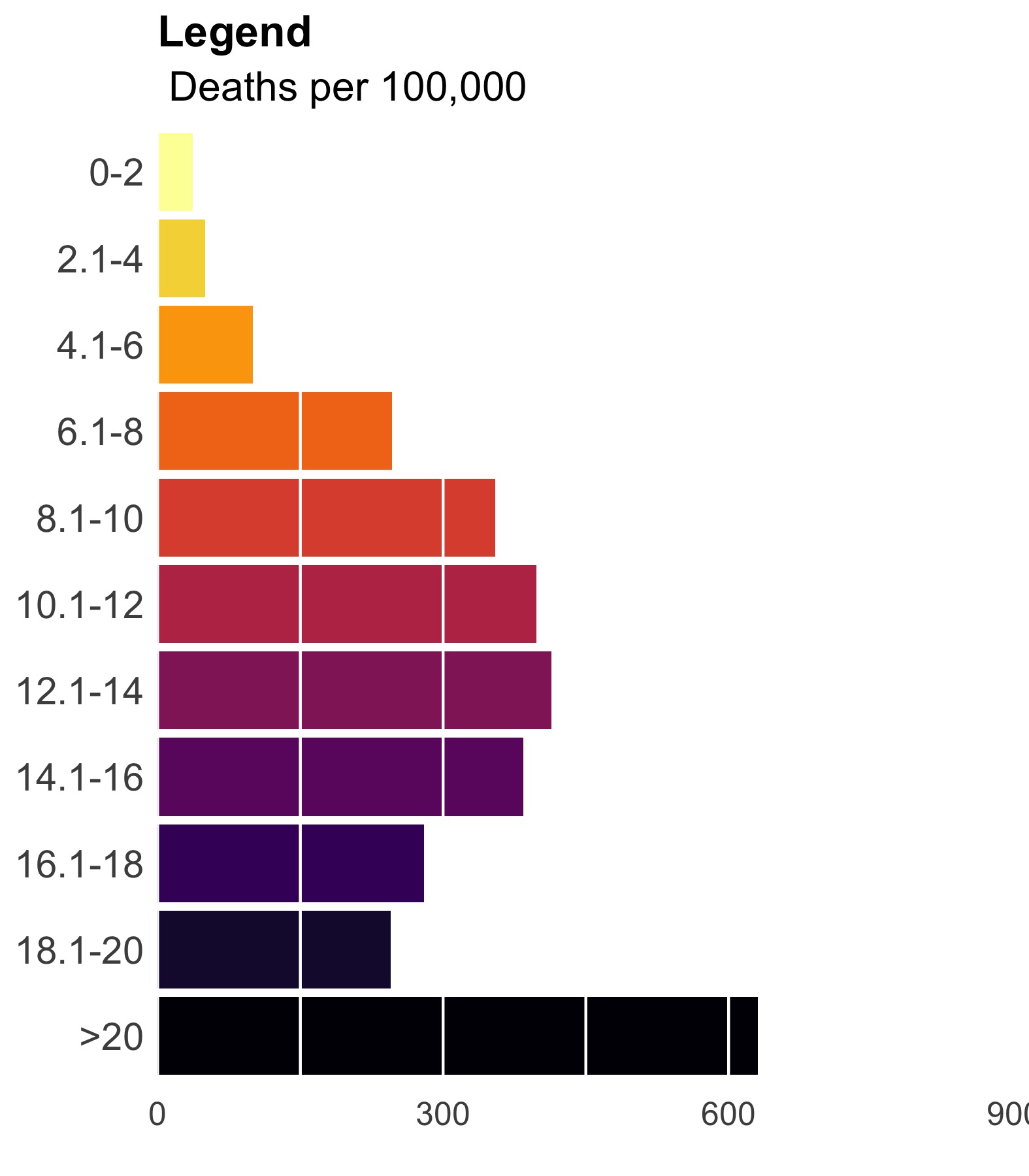
Much closer. Now, let’s add some vertical lines, remove the ink we don’t need, and add some useful text.
legend_plot <- legend_plot +
    theme(plot.title = element_text(size = 16, face = "bold"),
          plot.subtitle = element_text(size = 15),
          axis.text.y = element_text(size = 14),
          axis.text.x = element_text(size = 12),
          axis.line = element_blank(),
          axis.ticks = element_blank(),
          axis.title.y = element_blank(),
          legend.position = "none",
          panel.background = element_rect(fill = "transparent",colour = NA),
          plot.background = element_rect(fill = "transparent",colour = NA)) +
    geom_hline(yintercept = seq(0, 900, 150), color = "white") +
    labs(title = "Legend", subtitle = " Deaths per 100,000")
ggsave(legend_plot, file = './final_legend.jpg',
       height = 2, width = 1.75, scale = 3)
4. Now put the legend on the map.
Use ggplotGrob() to render the legend and then place the legend on the map using annotation_custom(). You’ll have to play with the alignment manually since it changes depending on the size and scale of your final product. Here, I aligned things to the lower right by setting ymin and xmax to the lower right corner and offset everything from there. The size of this viewport dictates the size of your legend so play around.
legend_grob = ggplotGrob(legend_plot)

final_plot <- map_2014 + annotation_custom(grob = legend_grob,
                                    xmin = max(subcounties_df$long) - 11,
                                    xmax = max(subcounties_df$long) - 1,
                                    ymin = min(subcounties_df$lat),
                                    ymax = min(subcounties_df$lat) + 9)

ggsave(final_plot, width = 8, height = 5, scale = 2, limitsize = FALSE,
       file = './jpeg_drug_deaths_2014.jpg')
The final plot is the one you see at the top of the post.
I also created a loop and looped through all the years. A slideshow is here (you may have to use the slow domain or use the standalone viewer):

As always, full code can be found here.