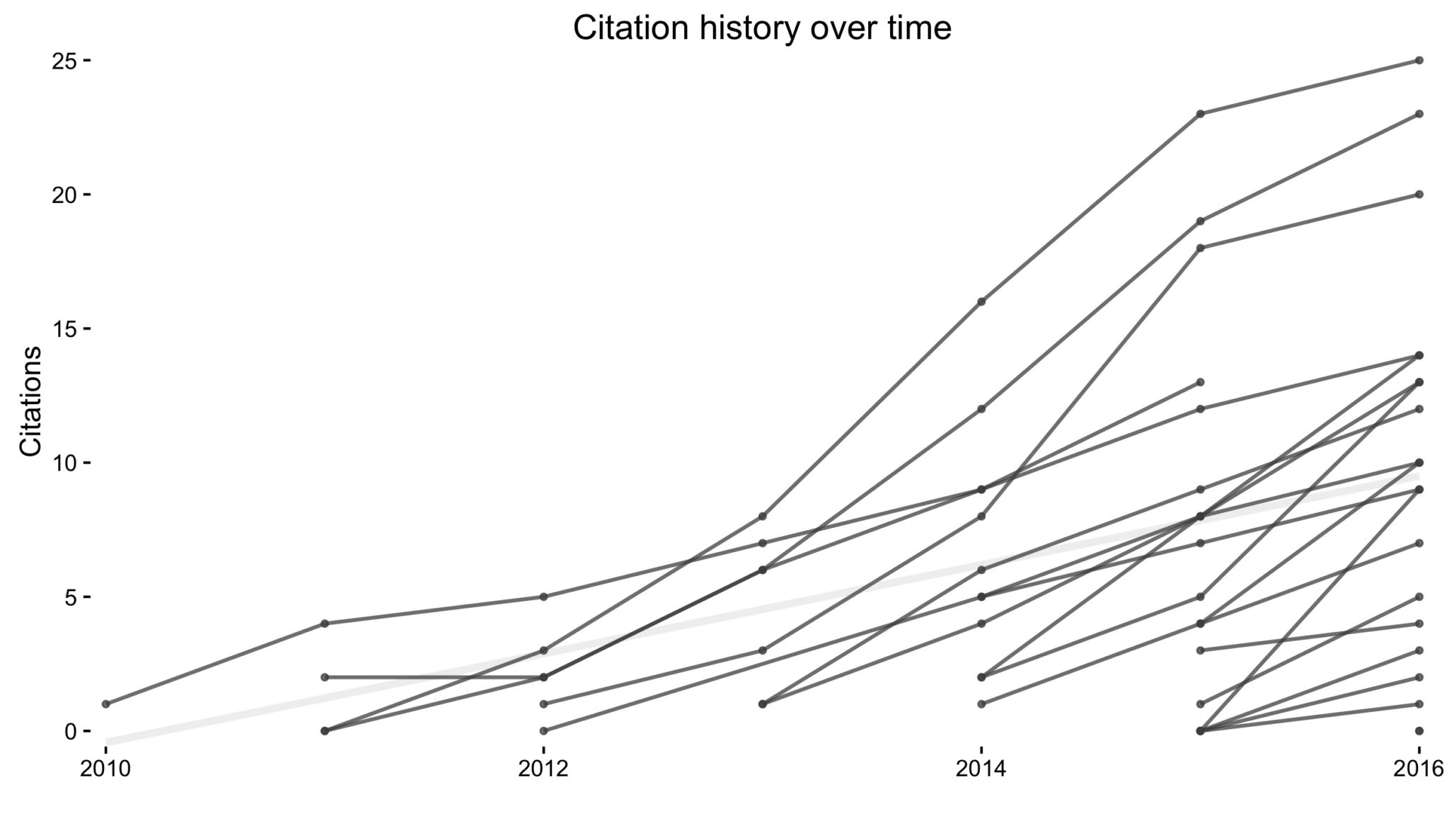
 I recently came across this paper by Michal Brzezinski about (the lack of) power laws in citation distributions. It made me a little curious about the citations of my own articles so I threw together a little script using James Keirstead’s Scholar package for
 R. In the plot above, every line represents a single article with time on the x-axis and (cumulative) number of citations on the y-axis.
It’s not super informative, so we can break it down a few ways to graphically explore the data.
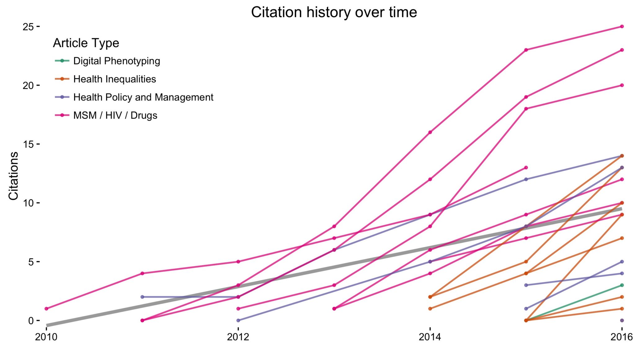
The easiest thing to do is to simply color-code each article by the type of research it involves. My research spans four overlapping phases: (1) My work with CHIBPS studying the intersection of HIV, drug use, and behavior among young men who have sex with men in New York City; (2) my two years as a research assistant in Health Policy and Management studying surgical safety checklists, implementation of health initiatives, and patient-centric care; (3) the start of my doctoral program and studying socioeconomic and racial disparities in health; and (4) my more recent (and concurrent with 3) work on digital phenotyping with the Onnela Lab.
Once each article is color-coded, we can see my research transition over time below. The grey line represents the best fit (linear regression) line across all articles and groups.
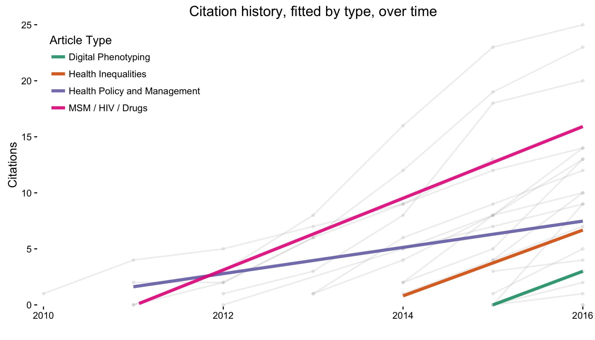
What if we were interested in the actual slope of each group? That is, do some areas appear to get cited more quickly than other research areas? Plotting the same data as above, but fitting the regression line for each group, we can see the slope for all groups are relatively similar except for Health Policy and Management, which appears to have picked up new citations a little slower than the others.
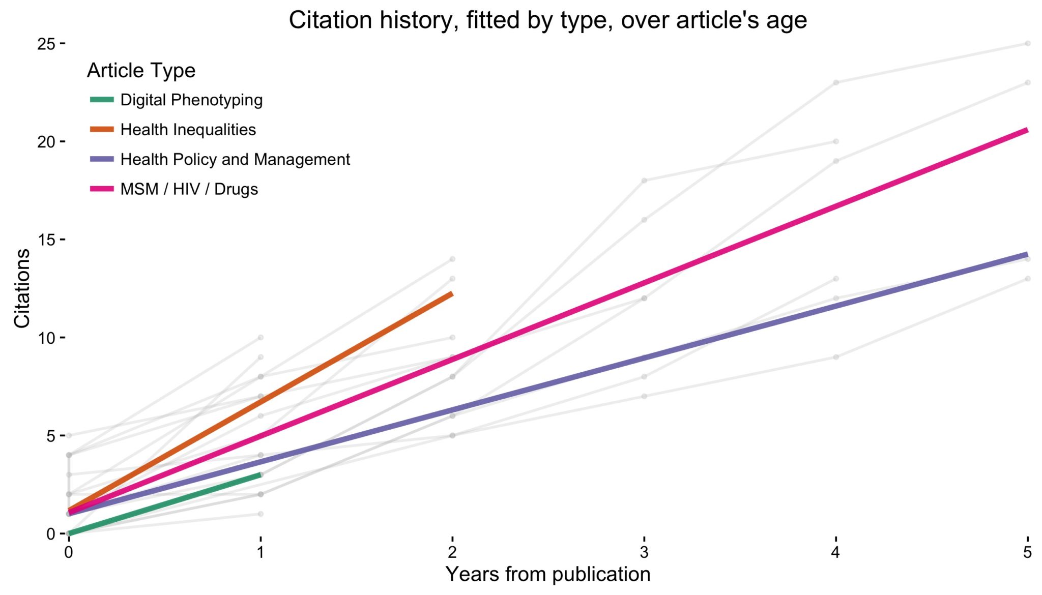
We can show this more clearly by shifting all articles to 0 and instead plotting the age of each article. Visualizing it this way shows my health inequalities articles picking up citations the fastest and confirms HPM articles (at least my HPM articles) picking them up more slowly.
Now, suppose we want to know what the composition of my citations in regards to article type over time. We can plot a stacked bar chart below with each bar representing a year and the y-axis representing number of citations. Again, colors represent article type. Unsurprisingly, we see my older work taking up a smaller proportion of the total number of citations as time progresses.
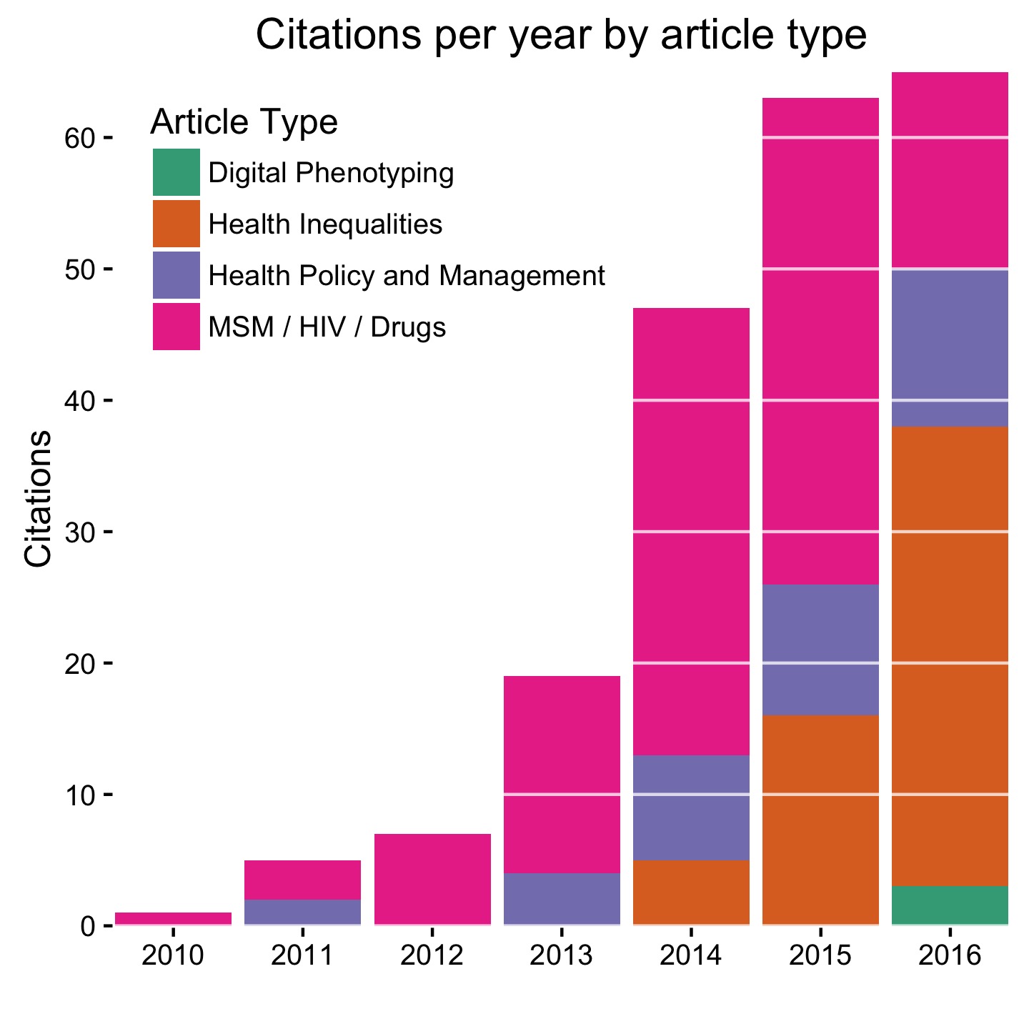
No real take home message here. Except maybe if you’re looking for ways of increasing your citation count in the field of public health, health inequalities seems to be a good way to go — which is fortunate because you won’t be making any money. Also, there seems to be a bug in Google Scholar. It shows my total citations as being over 200, yet when counting the citations for each individual article, I’m still well below that. Code here.
Acknowledgement: Helpful comments by Monica Alexander on the first plot inspired the rest of this post.