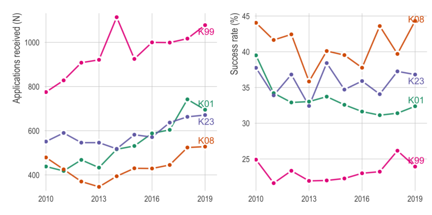
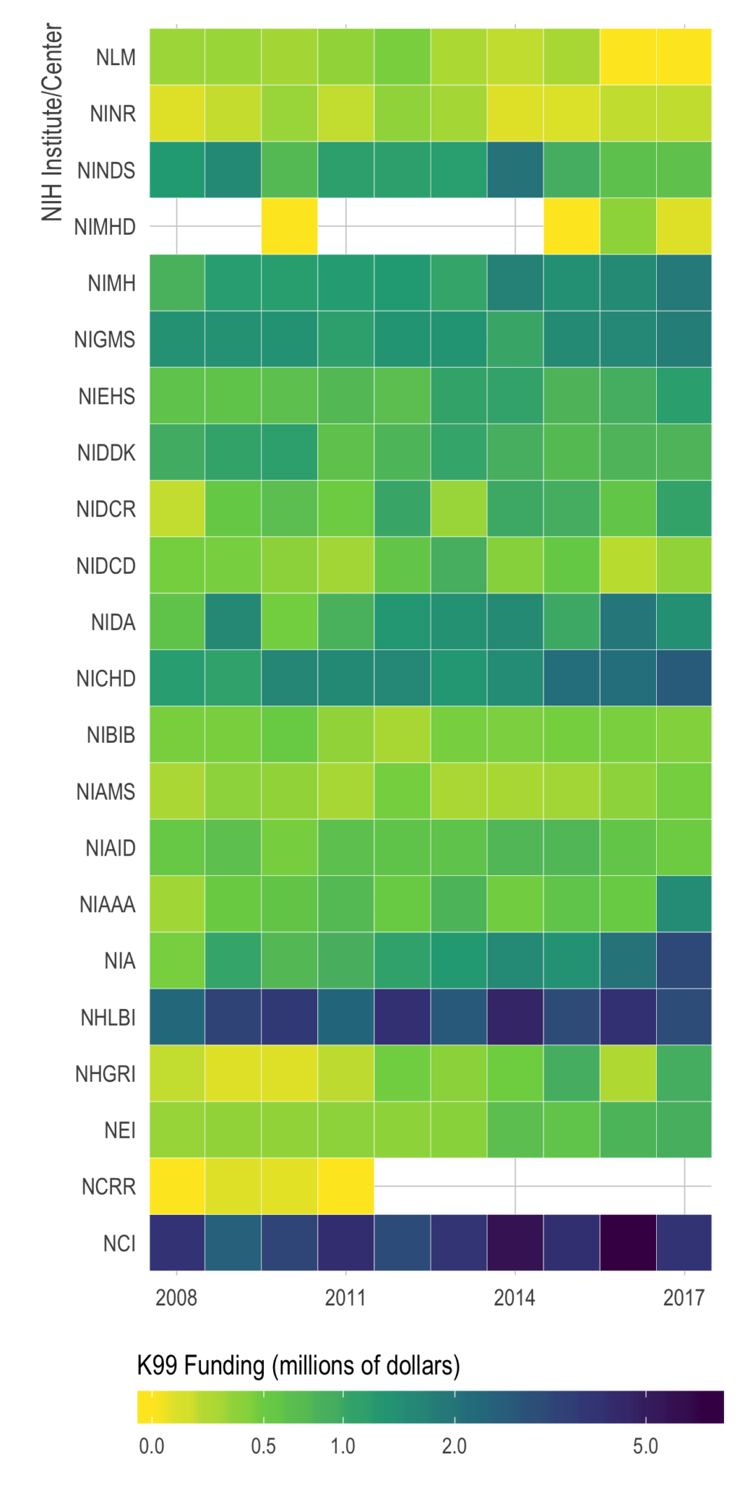
Just putting it here, with no commentary, in case others who are applying for K’s might find it useful.
Quick look at NIH K-award funding
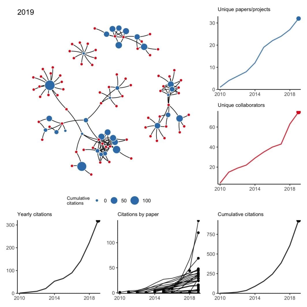
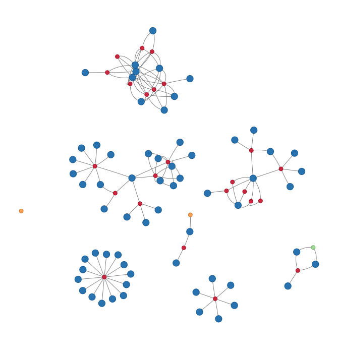
My Collaboration Network
My Twitter timeline is blowing up with #NetSci2018 tweets and awesome visualizations this week, so I was inspired to see if I can quickly make my own “gratuitous collaboration graph” (as Dan would say).
Hover over each node to see the name of the paper (red), co-author (blue), or other project (green for data and orange for software).
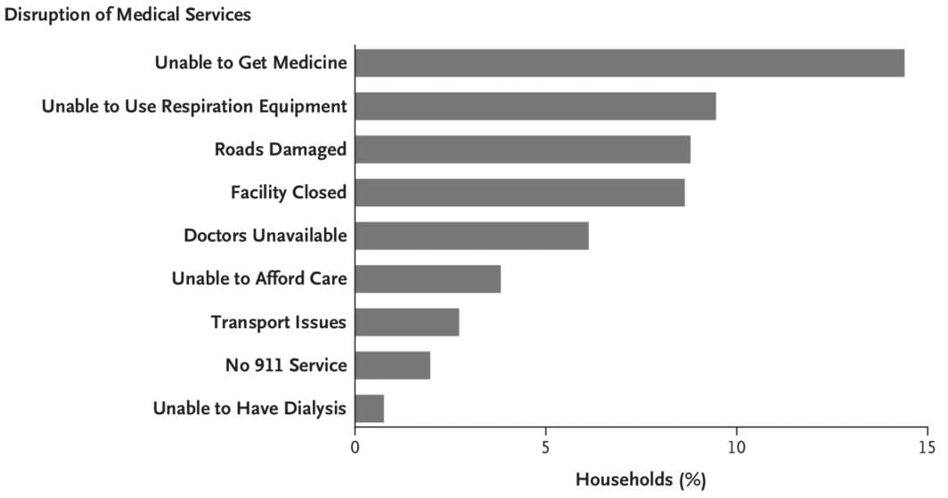
Our NEJM paper “Mortality in Puerto Rico after Hurricane Maria”
Here is a non-exhaustive list of materials related to our new paper in New England Journal of Medicine, “Mortality in Puerto Rico after Hurricane Maria.” While I normally just link to my papers, this particular paper garnered a significant amount of attention and was viewed over 100,000 times. Not all the attention was good, accurate, or fair — but that is for another post.
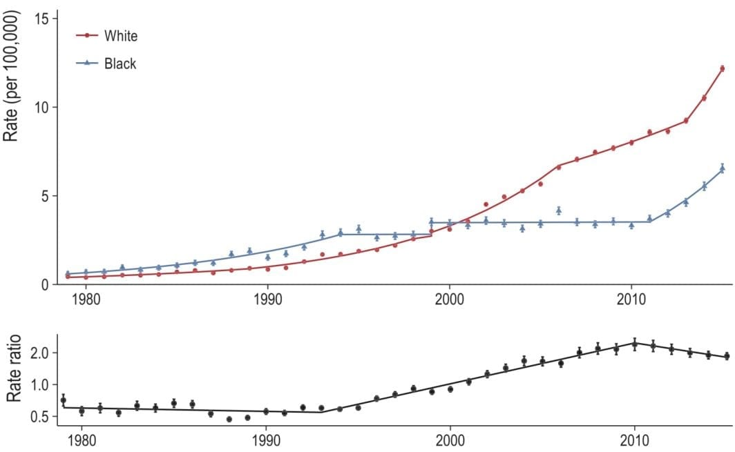
Looking at opioid-related mortality, by race, 1979 to 2016
Our paper (with Monica Alexander and Magali Barbieri) is out now (in published ahead-of-print form). Monica has a great, short Twitter thread on the findings so if you don’t want to read the whole thing, check that out. The publisher’s PDF is here.
After submitting our paper, the NCHS released the 2016 multiple cause of death files — so a couple months ago we were curious to see how (or if) our results would change when adding the 2016 data.
[NOTE (2/25/2019): Since this post, the 2017 data have also been released. I did a similar analysis comparing our original paper with the additional two years of data. See this post here or our Github repo.]tldr; San Diego weather is better than Boston weather
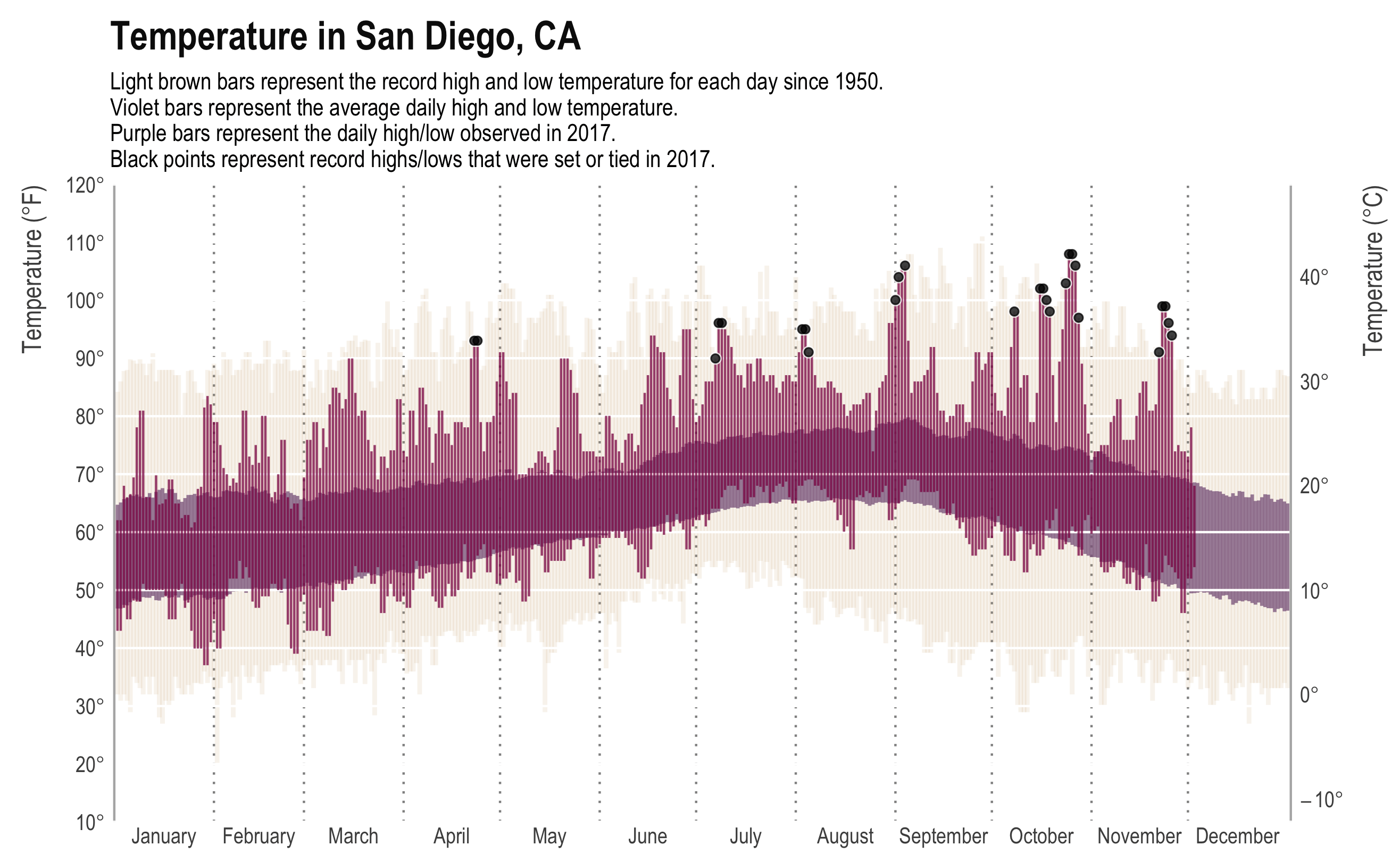
I am taking a break from a crazy couple months of writing and coding by… writing code. Just a quick post comparing weather in Boston (where I am) to weather in San Diego (where I’m from).
While the New York Times may have made the original, most data viz people will recognize the plot above from Tufte’s classic, Visual Display of Quantitative Information. It presents a ton of data in a clear, concise, and appealing way. The background bars show the record high and low daily temperature, the mid-ground bars show the “normal” (though as far as I can tell, normal is never clearly defined) high and low temperature, and the foreground shows the high and low for that year. In addition, we have annotations for days that met or made the record. The original plot even had a subplot for daily precipitation.
Here is a similar plot for Boston:
Replacing decimal points with interpuncts in MS Word
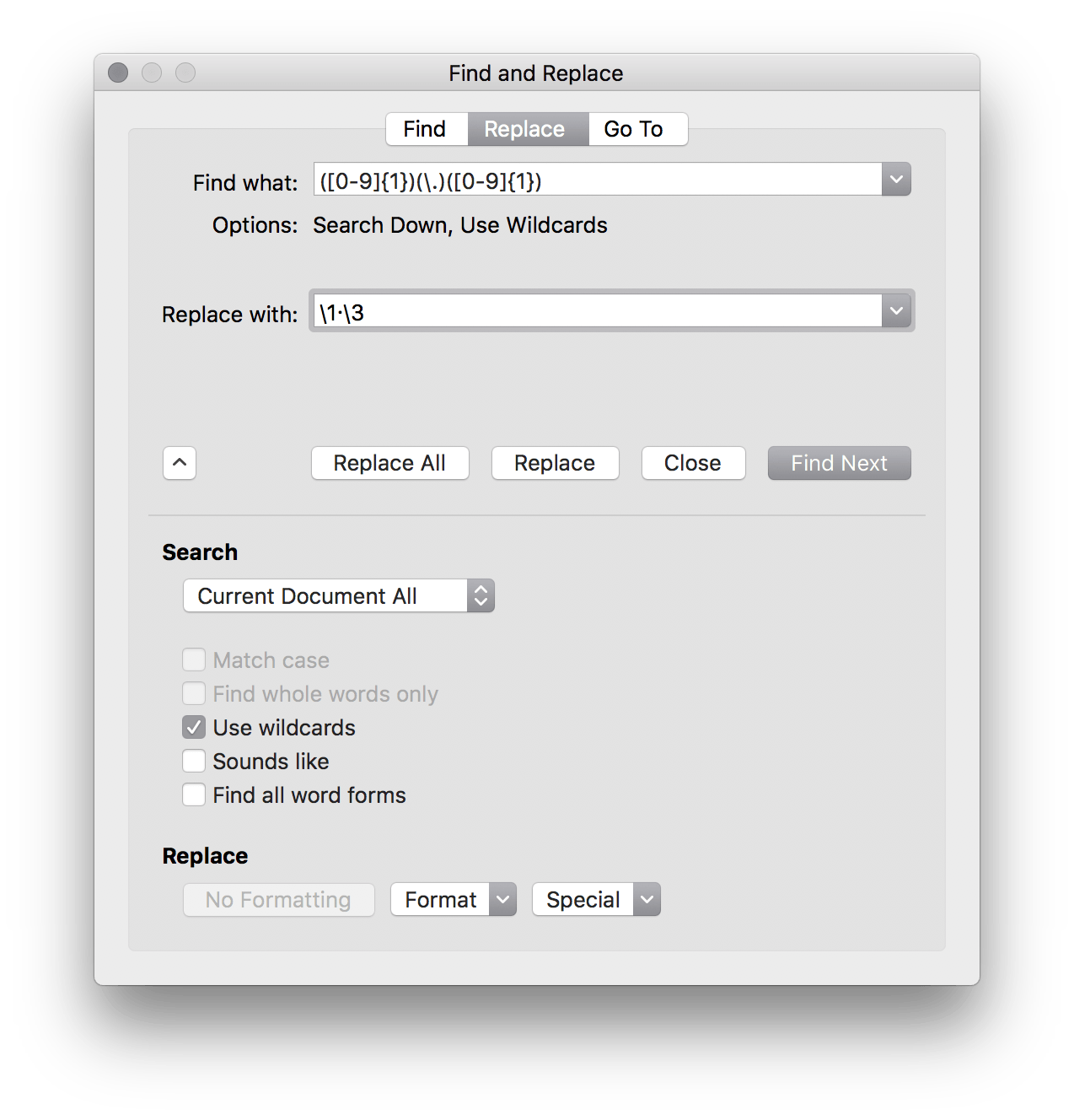
It turns out Microsoft Word’s “Advanced Find and Replace” is quite… well, advanced. You can actually use regex
to do relatively complex find and replace functions. For example, The Lancet requires that all decimal points be middle dots (i.e., interpuncts). This is pretty trivial in LaTeX or Rmd
and turns out it’s equally easy in Word.
Just use ([0-9]{1})(\.)([0-9]{1})
as your search query and \1·\3
as your replacement with the “Use wildcards” option.
We (as a field) should still be moving over to doing our drafting in Rmd
or LaTeX though. The bloat on MS Word makes working with moderate sized manuscripts with figures painful.
Using R, Wikipedia, and SHERPA/RoMEO to show New England Journal of Medicine‘s pre-print statement is empirically false
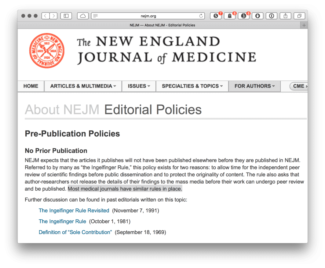
One of the most fundamental aspects of collaborative research is sharing your work with others through pre-print or conference presentations. This isn’t likely to be news to anybody doing collaborative research these days, and many journals have become increasingly permissive with their pre-print policy. For example, Nature released an editorial making it clear, “Nature never wishes to stand in the way of communication between researchers.[…] Communication between researchers includes not only conferences but also preprint servers. The ArXiv preprint server is the medium of choice for (mainly) physicists and astronomers who wish to share drafts of their papers with their colleagues, and with anyone else with sufficient time and knowledge to navigate it. […] If scientists wish to display drafts of their research papers on an established preprint server before or during submission to Nature or any Nature journal, that’s fine by us.”1 Other prestigious journals have similar policies—for example, The Lancet, Science, PNAS, and BMJ. (The list goes on and on.)
One such journal does did not. New England Journal of Medicine (Figure 1).
Using a histogram as a legend in choropleths

One way to address this is to use a histogram as a legend on your map. The histogram then provides you with a way of showing raw counts of equal weights while the map allows you to provide the spatial context of the values.
Use bash to concatenate files in R
Often, I find I need to loop through directories full of csv
files, sometimes tens of thousands of them, in order to combine them into a single analytical dataset I can use. When it’s only a few dozen, using fread()
, read_csv
, or the like can be fine, but nothing is quite as fast as using awk
or cat
.
Here’s a snippet of code that allows one to use bash
in R
to concatenate csv
files in a directory. People in the lab have found it helpful so maybe others will as well.