· 4 min read

Quick look at NIH K-award funding

Motivated by a chat with Maria Glymour, I took a quick look at NIH K-award funding rates. It’s a very exploratory/descriptive look, but all the code is up on my GitHub. I’m hoping to find time to dive into the data more at some point.

Just putting it here, with no commentary, in case others who are applying for K’s might find it useful.

Overall, how much money does the NIH award through these early career mechanisms?
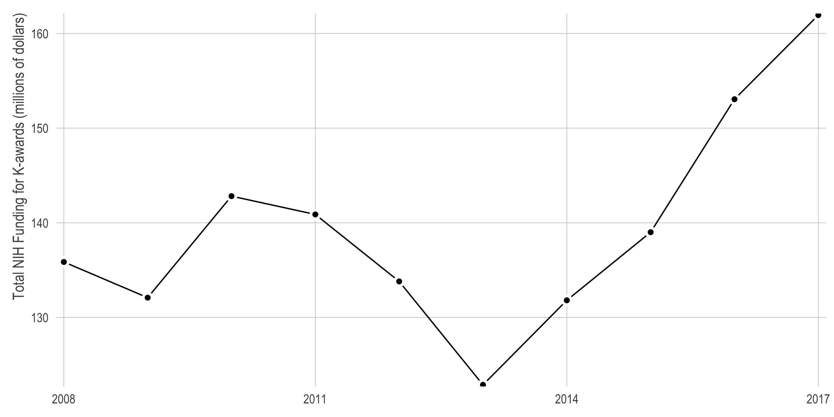
A line chart of total NIH funding for K-awards in millions of dollars, 2008 to 2017, y-axis about 123 to 162. It starts near 136 million, dips to 132, rises to a local peak of 143 in 2010, then falls to its low of about 123 million in 2013. From there it climbs every year, steeply after 2015, ending at about 162 million in 2017 — the highest point on the chart.

What is the breakdown of K-award funding by institute/center?
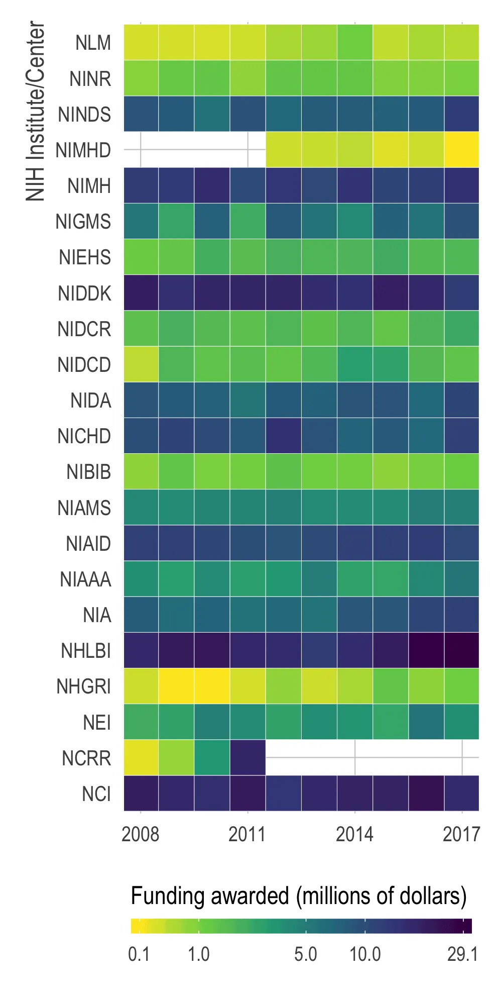
A heatmap with one row per NIH institute or center, 21 of them labelled by acronym from NLM at the top down to NCI at the bottom, and one column per year from 2008 to 2017. Colour is funding awarded in millions of dollars on a legend running 0.1 in yellow through 1.0 and 5.0 to 29.1 in near-black. NHLBI, NIDDK, NCI and NIMH are the darkest rows, awarding the most; NLM, NIMHD and NHGRI are the yellowest, awarding the least. Two rows are blank for part of the period — NIMHD before 2012 and NCRR after 2011.

Which mechanisms provide the most funding, by institute/center?
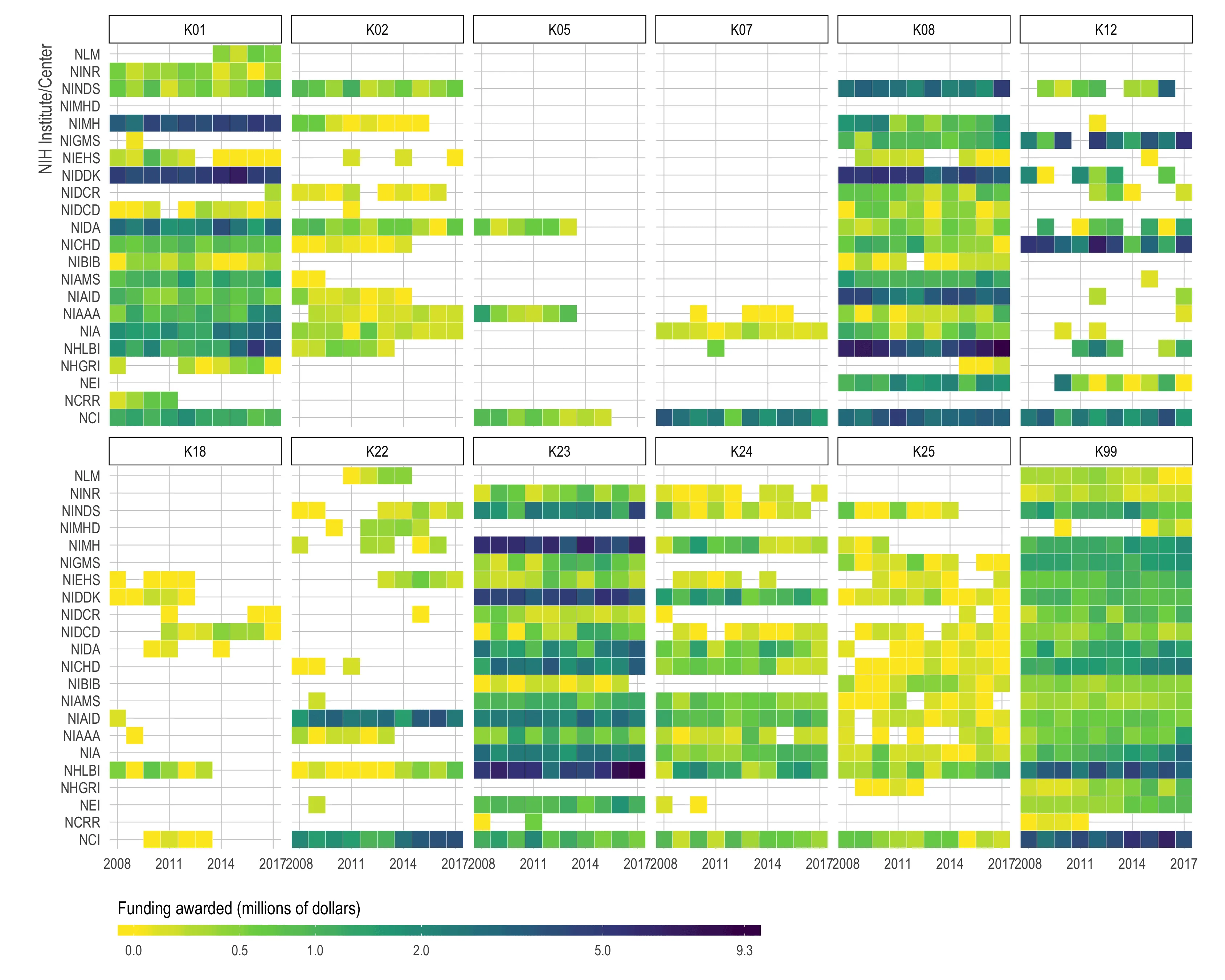
Twelve heatmaps in two rows, one per K-award mechanism: K01, K02, K05, K07, K08 and K12 on the top row, K18, K22, K23, K24, K25 and K99 below. Each has one row per NIH institute, 21 labelled by acronym, and one column per year from 2008 to 2017, with colour showing funding awarded in millions of dollars on a legend from 0.0 in yellow through 0.5, 1.0, 2.0 and 5.0 to 9.3 in near-black. Blank cells mean no award that year. K23, K99, K08 and K01 are nearly full grids across most institutes; K05, K07, K18 and K25 are mostly blank, with awards from only a handful of institutes. NHLBI and NIDDK are the darkest rows wherever they appear.

Which mechanisms/centers receive the most applications and have the highest success rate?
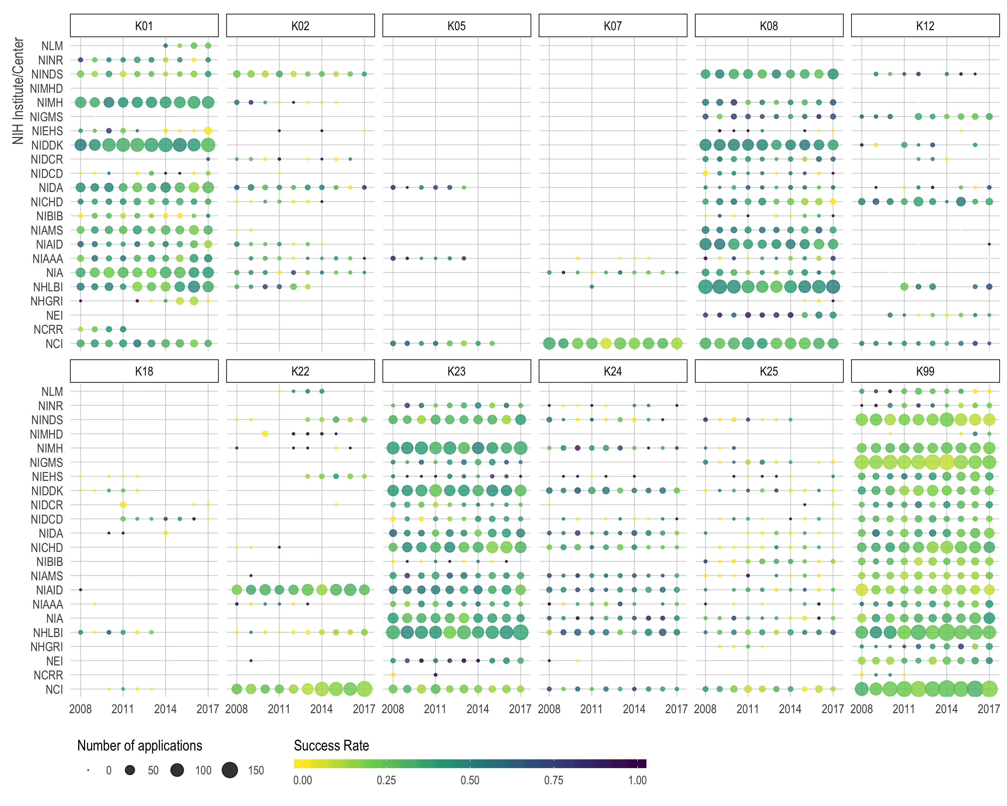
Twelve panels in two rows, one per K-award mechanism: K01, K02, K05, K07, K08 and K12 on the top row, K18, K22, K23, K24, K25 and K99 below. Each plots one dot per NIH institute and year, 21 institutes labelled by acronym down the side and years 2008 to 2017 across. Dot size is the number of applications on a legend of 0, 50, 100 and 150, and colour is success rate on a legend from 0.00 in yellow through 0.25, 0.50 and 0.75 to 1.00 in near-black. K23, K99, K08 and K01 carry the largest dots, so most applications go to those four. K99's dots are the palest overall, meaning the lowest success rates; K05, K07, K18 and K25 have only scattered small dots.

How has the success rate and funding amount changed over time for the “big K’s”?

An animation stepping through the years 2008 to 2017, the year shown in a heading that updates as it runs. Four panels, one per major K mechanism — K01, K08, K23 and K99. Each plots proportion of applications funded on the x-axis, 0 to 1, against total amount funded in millions of dollars on the y-axis, 0 to about 9. One dot per NIH institute, sized by number of applications on a legend of 0, 50, 100 and 150, and coloured by institute on a legend naming all 21. Across every year the dots cluster between about 0.2 and 0.5 on the x-axis, so most institutes fund between a fifth and half of what they receive, and they drift upward over time as the amounts grow. K99's dots sit furthest left, at the lowest funded proportions.

Conclusion

I might add more analysis or make a Shiny app in the future. If I do, the GitHub repo will be the place to look.