Looking at opioid-related mortality, by race, 1979 to 2016
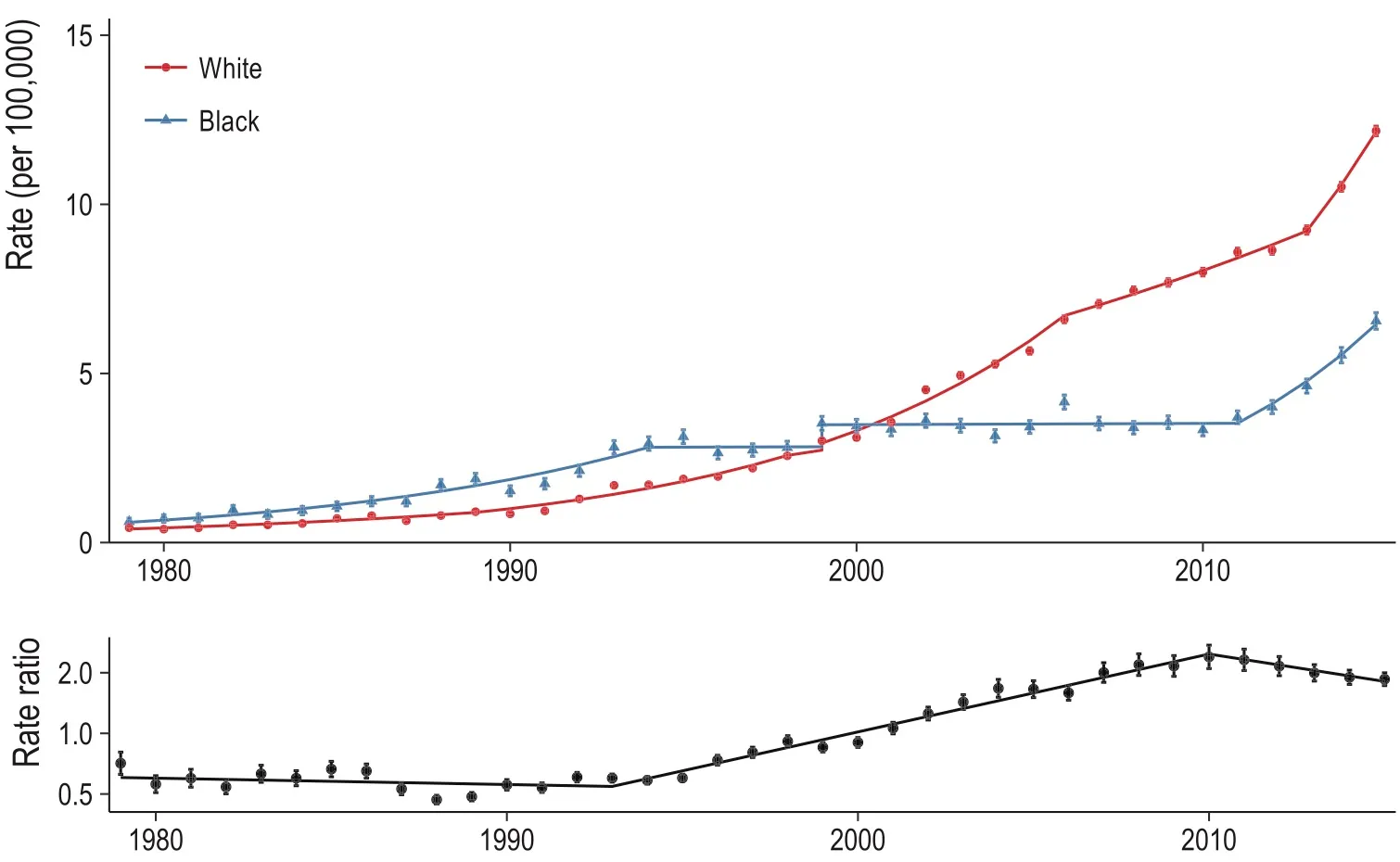
Our paper (with Monica Alexander and Magali Barbieri) is out now (in published ahead-of-print form). Monica has a great, short Twitter thread on the findings so if you don’t want to read the whole thing, check that out. The publisher’s PDF is here.
After submitting our paper, the NCHS released the 2016 multiple cause of death files — so a couple months ago we were curious to see how (or if) our results would change when adding the 2016 data.
[NOTE (2/25/2019): Since this post, the 2017 data have also been released. I did a similar analysis comparing our original paper with the additional two years of data. See this post here or our Github repo.]
So before I get started, I should mention some important caveats:
- Joinpoint models are great at describing linear trends in terms of segments and changepoints — this makes it really easy to understand, interpret, and explore a time series. However, they are not great at forecasting because your forecast is essentially a linear regression based on a small subset of your data (i.e., your most recent segment) with no other covariates.
- I did not plot confidence intervals — but they exist. This last week has taught me an important lesson in emphasizing uncertainty and there is a lot of uncertainty in a joinpoint model. You need to account for uncertainty around any given line segment and you need to account for uncertainty in the location of your joinpoints. Since changing any single joinpoint will change (at least) two line segments, it’s not straightforward how to account for this when plotting. That said, I’m sure there is a way, but that’s probably for a different blog post.
Figure 1
Alright. So what did I do? I just took our 2015 results (the ones published in our paper) and projected the model out one year (to 2016). I then reran our entire pipeline to include the 2016 data. Now I’ll plot both lines next to each other: the 2015 model results are dashed and the 2016 model results are the solid line. Here is Figure 1, which plots the all opioid-related mortality rate, by race, for the black (blue) and white (red) populations from 1979 to 2016 (top) and the corresponding black/white rate ratio (bottom):
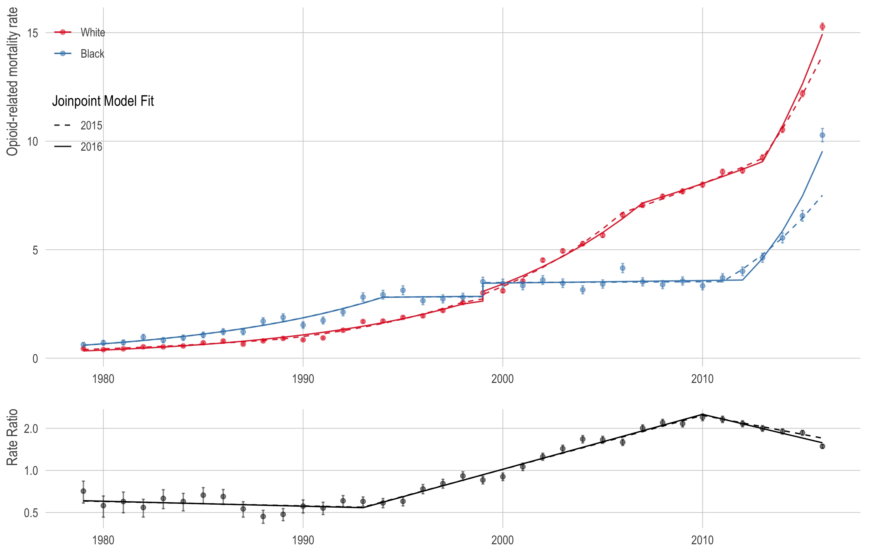
In terms of opioid mortality, 2016 was a bad year for both the black population (10.2 per 100,000) and the white population (14.9 per 100,000). The 2015 model under-predicted the observed 2016 rate by a nontrivial amount.
This is concerning because the 2015 model results were already quite high with annual percent increases of 16 (95% CI: 10, 23) for the black population and 15 (95% CI: 6, 25) for the white population. Compare this to the 2016 model, which had the black and white opioid mortality rates increasing at 28 (95% CI: 21, 34) and 18 (95% CI: 13, 24) percent year over year, respectively.
As the parallel increase in blacks and whites continues, the rate ratio is decreasing (in a bad way) slightly faster than the 2015 model indicated, but it’s close and unlikely to be statistically significant.
Figure 2
We’re going to skip Figure 2 because (as we can see above) joinpoint models are relatively robust in the early years if you’re just adding a small number of data points (relative to the total number of data points) at the end of your time series. All the code is available on our project Github if you feel inspired to generate the Figure 2 graph yourself.
Figure 3
Figure 3 breaks down the opioid mortality rate by the ICD-10 opioid type. Since the ICD-10 codes were not implemented until 1999, there are fewer years so our results will be more sensitive to adding data. As a reminder, these are not mutually exclusive categories so the rates will not add up to the overall rate. In addition, I removed methadone and unspecified opioid from this plot (even though they are in the published plot) because the models are largely the same.
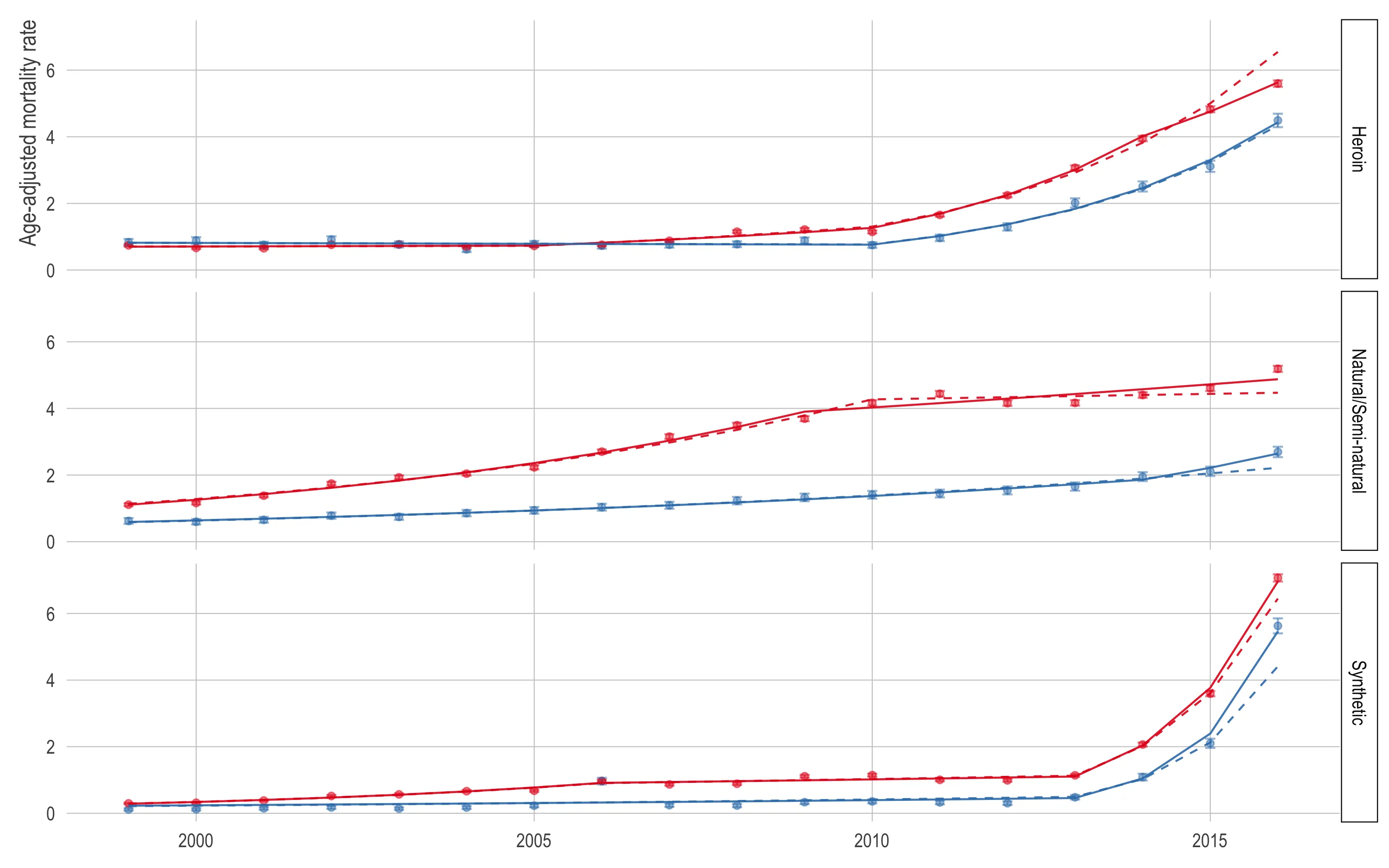
Again, it appears the 2015 model under-predicted in most cases. The exception is the white (red) and black (blue) heroin (top) mortality rates. For the black population, the model was right in line with the observed 2016 heroin mortality rate (4.5). However, the white heroin mortality rate in 2016 was 5.6 per 100,000 while the model predicted 6.5.
The most noteworthy thing here is that the synthetic opioid mortality rate appears to be growing even faster than our paper suggested. This is especially true for the black population which already had an obscenely high rate of growth in synthetic opioid mortality. In our paper, we estimate that the synthetic opioid mortality rate was increasing at 79% (95% CI: 50, 112) in the white population and 107% (95% CI: -15, 404) in the black population—noting the high uncertainty in both estimates but especially the black estimate.
In the 2016 model, the annual percent change of the synthetic opioid mortality rate in the white population is 88% (95% CI: 74, 102) and 128% (95% CI: 62, 222) in the black population.
Conclusion
Our substantive conclusions are robust to adding the 2016 data, and in fact may be strengthened by the additional data, which (1) increased the point estimate of the synthetic opioid mortality APC substantially and (2) increased the precision of the corresponding APC substantially.
Future Work
We’re continuing this work and looking at the interplay of geography and race in order to think about ways we can further investigate and potentially intervene in the epidemic at the subnational level. Check out our new Github repo, interactive results viewer, or better yet if you’re attending EPC 2018, check out Session 57!
All code for the re-analysis is up on our Github repo for this project.