· 4 min read

My collaboration network: 2010 to 2022 version

There was a lot going on last year and I missed my annual tradition of updating my collaboration network at the end of the year. However, thanks to a perpetual illness ravaging the house, I’ve found some sleepless hours to fix my old code and pick up the tradition again.

As is always the case when I do this exercise, I can’t help but reflect back on 2022 (and 2021) with gratitude and appreciation for my amazing collaborators. It was my first year on the tenure-track and hours that normally would have been spent pushing research forward were instead spent getting my feet under me, taking on new students, hiring new postdocs, building up some community partnerships, shuffling through administrative tasks, etc. There’s a lot of things I enjoy about the job but by far the most enjoyable thing is working on things I think are interesting and important with people I like.

An animation stepping one year at a time from 2010 to 2022. The main panel is the coauthor network: blue nodes are papers, sized by citation count on a legend from 5 to 250, and red nodes are collaborators. Each year the papers and coauthors added that year light up while everything earlier fades to the background, so the network grows outward from a few small clusters. Five smaller panels advance in step: new manuscripts per year against a long-run average line, new collaborators per year against its own average, citations accumulating per paper as papers age, cumulative citations across all papers, and new citations each year. All five end higher than they start, with most of the growth after 2020.

Below is a plot of collaborations (circles) over time (x-axis) by collaborator (y-axis). The grey ones are collaborators I’ve never actually met in person while the black ones are collaborators I’ve met in person. I had assumed COVID would have impacted collaborations such that there would be many more collaborators I’ve never met in person but that doesn’t seem to be the case.
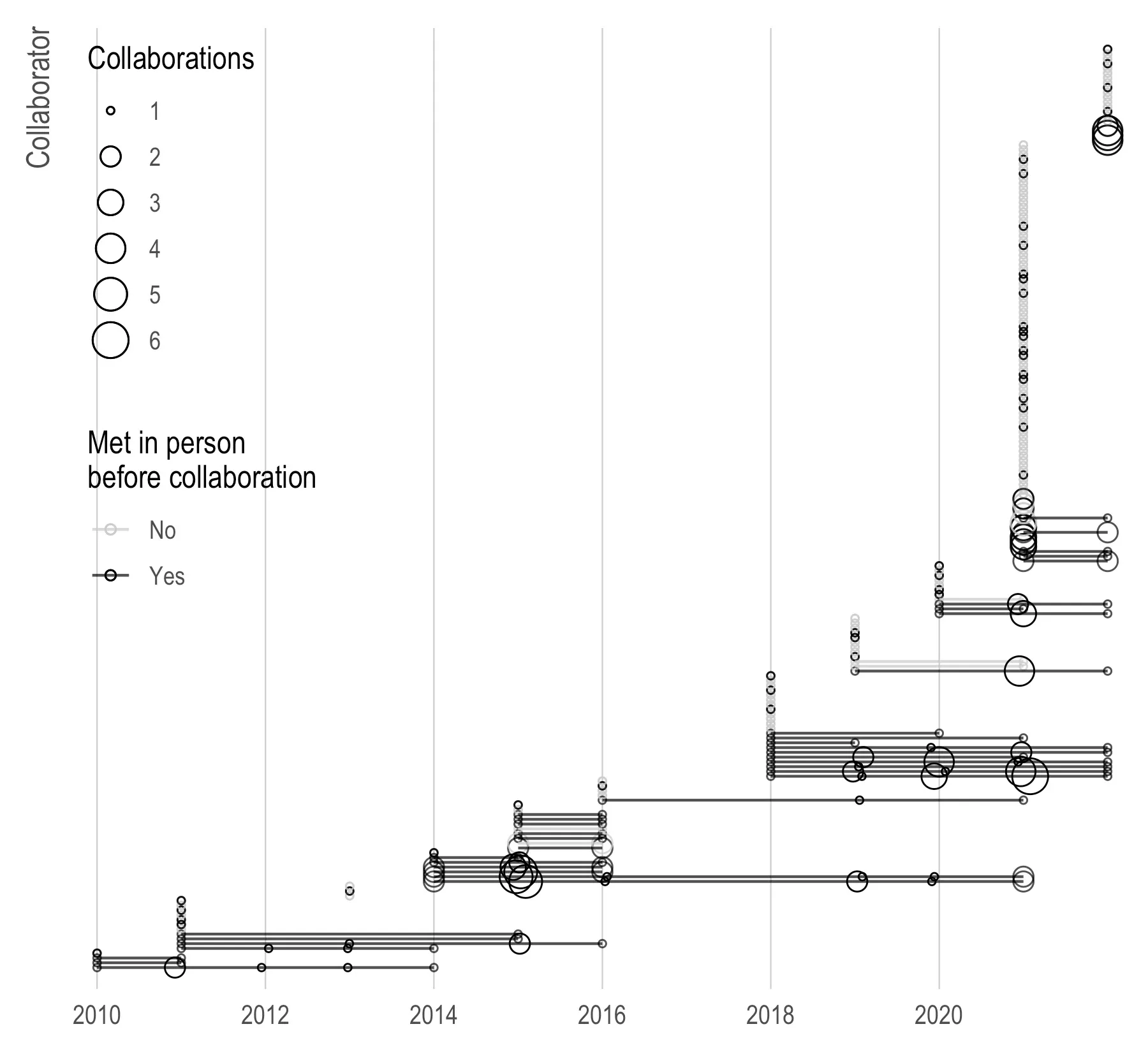
Collaborations over time, one row per collaborator with no names shown, from 2010 to 2022. Circle size is the number of collaborations that year, from 1 to 6, and a line joins each collaborator's first collaboration to their last. A second legend, titled Met in person before collaboration, gives light grey for no and black for yes; most rows are black. Vertical stacks of circles mark single papers with many coauthors, the tallest at 2021 running most of the height of the chart. Rows added from 2018 onward are dense and closely spaced, while the early rows are sparse and widely separated.

Here is a set plot of my top ten collaborators (in terms of numbers of collaborations) and their different sets. Surprisingly, this list has changed pretty substantially since 2020 with a core group of UCSF researchers (Kirsten, Maria, and Yea-Hung) shooting up the list.
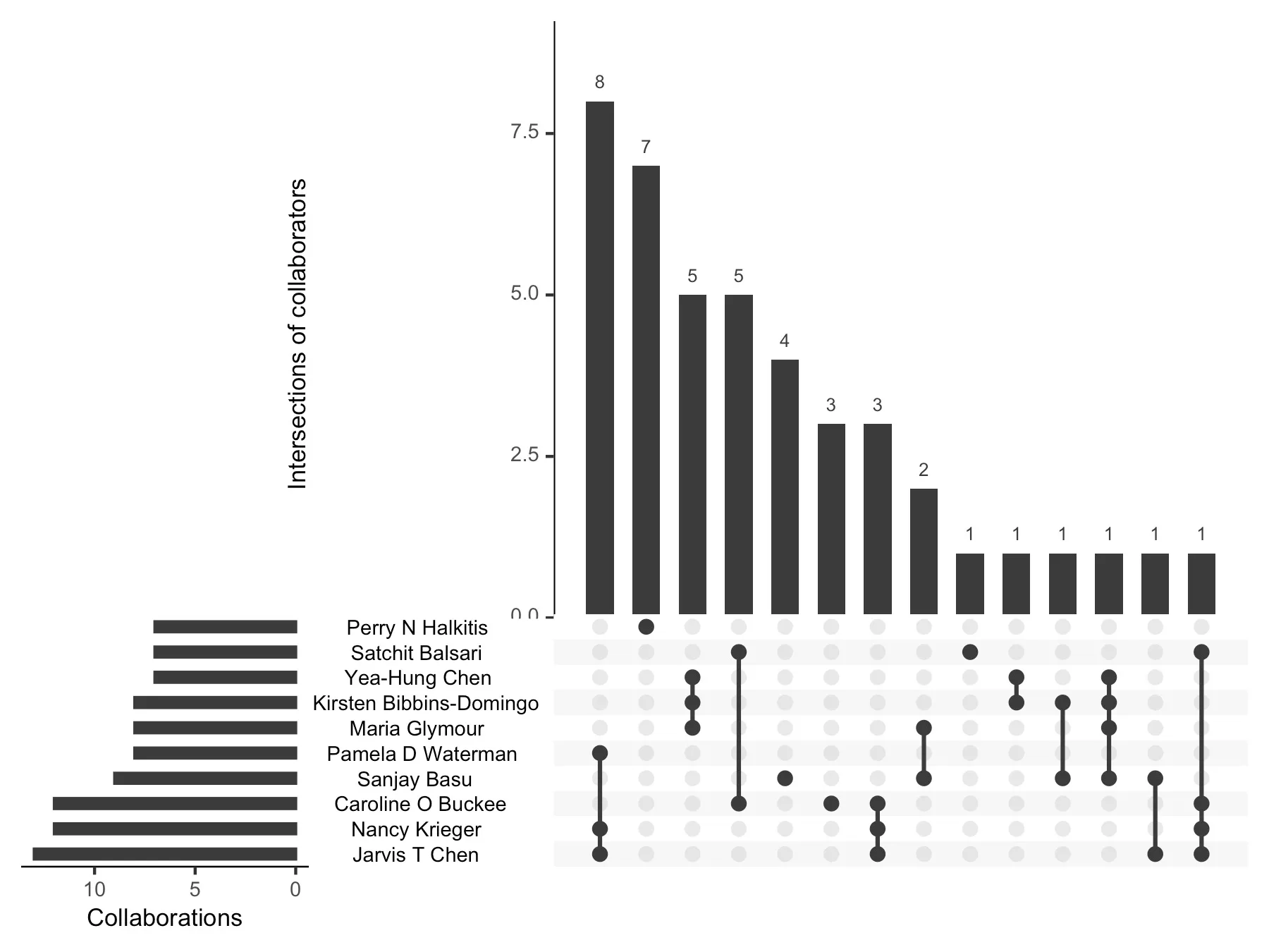
An UpSet plot of my ten most frequent collaborators, shown by name on the chart. Horizontal bars on the left give each person's total collaborations, sorted shortest at the top to longest at the bottom, the longest passing the axis's last label at ten. Vertical bars above show how many papers each combination of those people appears on: 8, 7, 5, 5, 4, 3, 3, 2, and six combinations with 1. Connected dots below each bar mark which people are in that combination. The tallest bar, eight papers, is a group of four; the second, seven papers, is a single person.

Conditional on having more than one collaboration, who are my “most efficient” collaborators in terms of average number of citations per project?
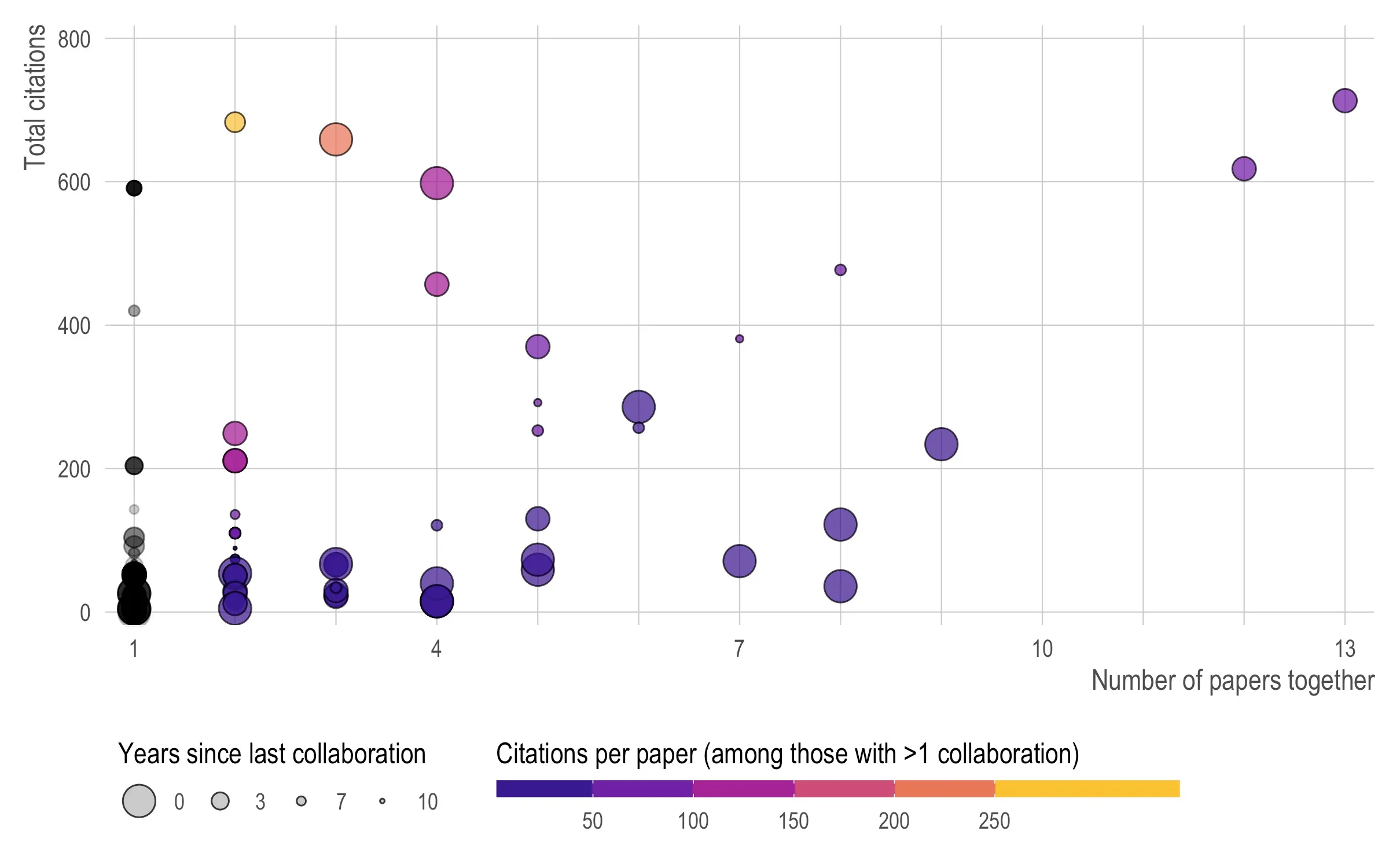
A scatter plot with number of papers together on the x-axis, 1 to 13, and total citations on the y-axis, 0 to about 720. Circle size is years since the last collaboration, larger meaning more recent, on a legend of 0, 3, 7 and 10. Colour is citations per paper among people with more than one collaboration, running dark blue-purple below 50 through magenta and red to yellow above 250; people with a single collaboration are black or grey. The one yellow circle sits at two papers and about 680 citations, the highest citations per paper. The rightmost point, at 13 papers, has the highest total at about 720. A dense black cluster at one paper sits below 100 citations.

And lastly, do COVID-19-related papers get more citations than non-COVID papers? Below I plot all papers published since 2020 along with their annual citations. The ribbons and bold lines represent the linear fit. As you can see, COVID papers have both a higher intercept (they get more immediate citations) and a slightly higher slope (they are cited more over time) that is probably not statistically significant.
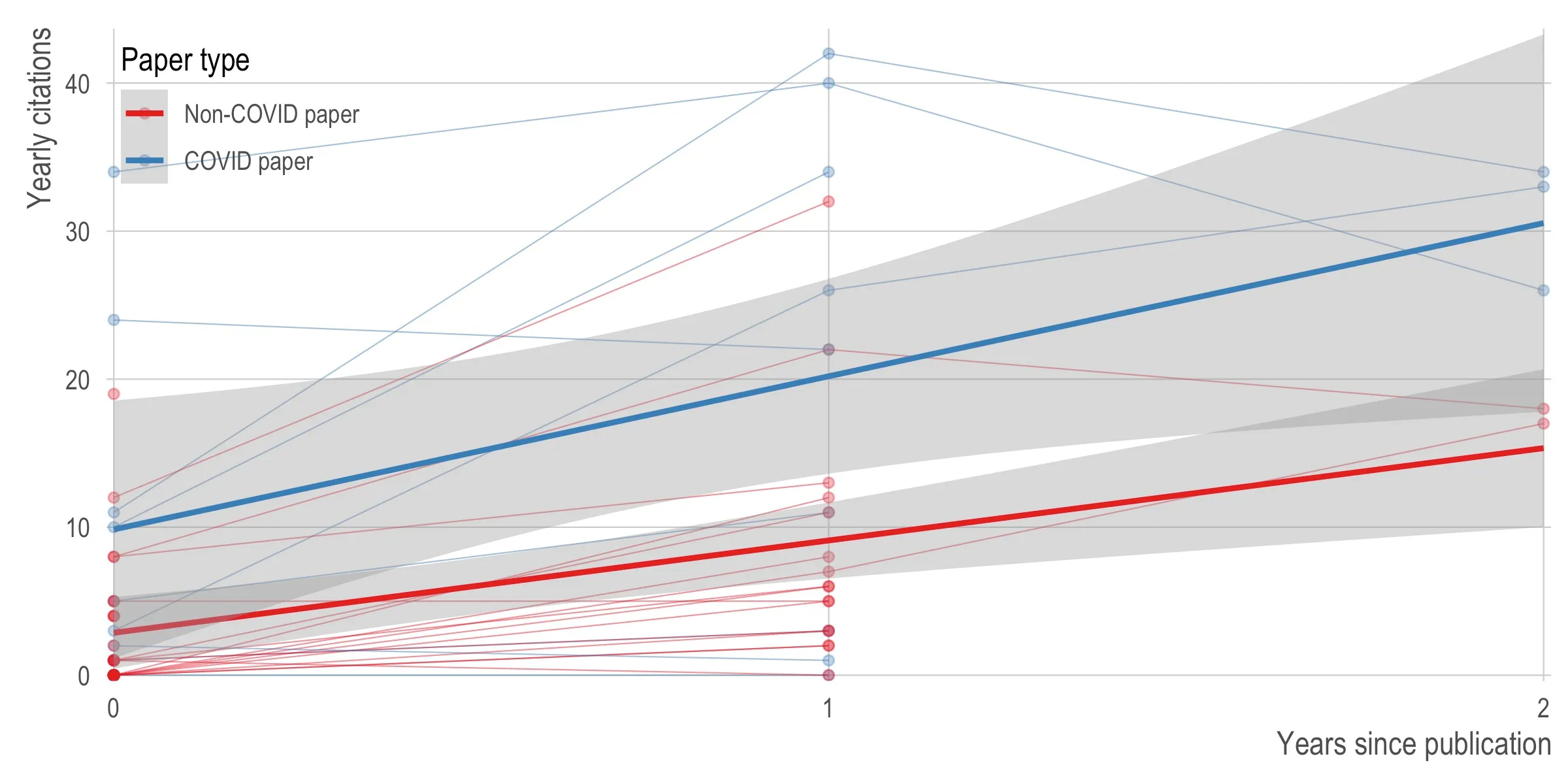
Yearly citations against years since publication, 0 to 2, with one faint line per paper and a fitted trend line and confidence band for each group. The legend, titled Paper type, gives red for non-COVID papers and blue for COVID papers. The COVID trend starts near 10 citations in the publication year and reaches about 30 by year two; the non-COVID trend starts near 3 and reaches about 15. The two confidence bands overlap throughout.