My collaboration network for 2010 to 2020 (+ other plots)
In what has become a bit of an annual tradition, here is my collaboration network for 2010 to 2020. This year was rough. Of the two first-author papers published this year, one was pre-pandemic. I think it’s fair to say this wasn’t the level of productivity I was expecting of myself. Hopefully, a few projects still in the pipeline will come out early next year.
All that said, I’m thankful for a strong network of kind collaborators who picked up my slack when necessary, checked in on me even when we didn’t have an active project, and understood when childcare issues caused last minute Zoom cancellations.
You’ll have plenty of time to work with famous, smart, and/or fun people — 2020 was a good reminder of the importance of working with kind people.

The first time I made this plot, I noted how many components I had and how disjointed the collaboration networks were. Since then, there’s now (1) a dominant connected component, (2) my NYU component (top middle) that will likely always be disconnected, (3) my Health Policy and Management cluster (top left), which has a reasonable chance of connecting with the rest of the group now that Sara is at Stanford, and (4) a single paper with Alex (middle right), which will almost certainly join the rest of the group at some point. It’s also interesting to note the trajectories of papers (in terms of citations) in the lower left. A couple papers seem to get some traction, but for the most part, my papers tend to add citations at around 5-10 cites per year.
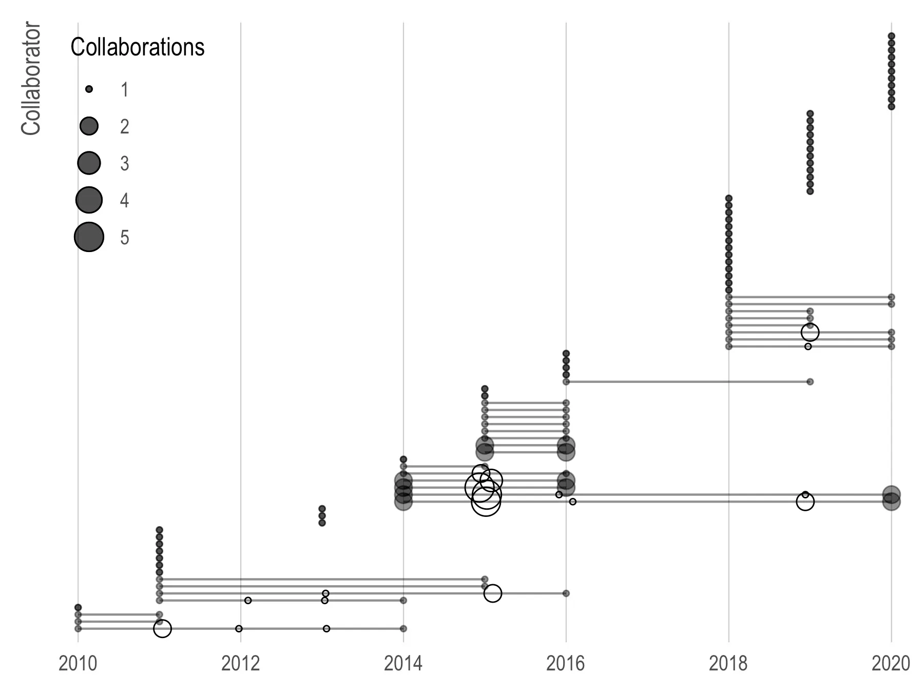
Below is a plot of collaborations (circles) over time (x-axis) by collaborator (y-axis). I’ve worked fairly consistently with two people, Nancy and Jarvis, for six years, which is pretty wild. Most of my collaborations are bursty with a rush of papers and then long dormant periods but a handful are pretty regular with ~1 paper per year. Most of my collaborators are one-time collaborators.
Another thing we can look at is which of my collaborators also collaborate together (conditional on me being on the paper). Below, I show the top ten (in terms of number of collaborations) collaborators with a horizontal bar chart for the number of times we have worked together. The lower right plot shows dots and lines of intersecting collaborators along with how often this subset of collaborators appears in my collaborations (vertical bars).
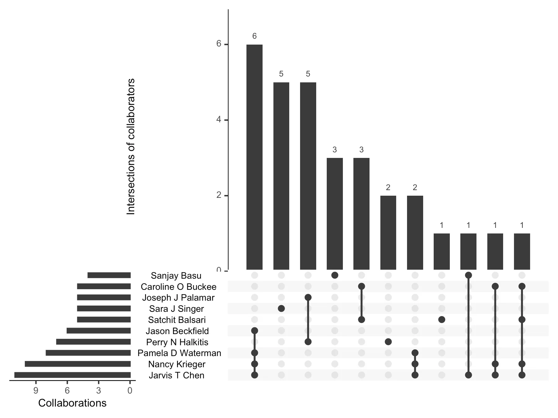
For example, there are six papers with Jason, Pam, Nancy, and Jarvis and additional two with the same group minus Jason. Sara is the outlier here with a 5 collaborations — none of which involve another top ten collaborator.
Lastly, for kicks I wanted to see who my “most efficient” collaborator is. That is, conditional on more than one project together, who has the highest average number of citations per project?
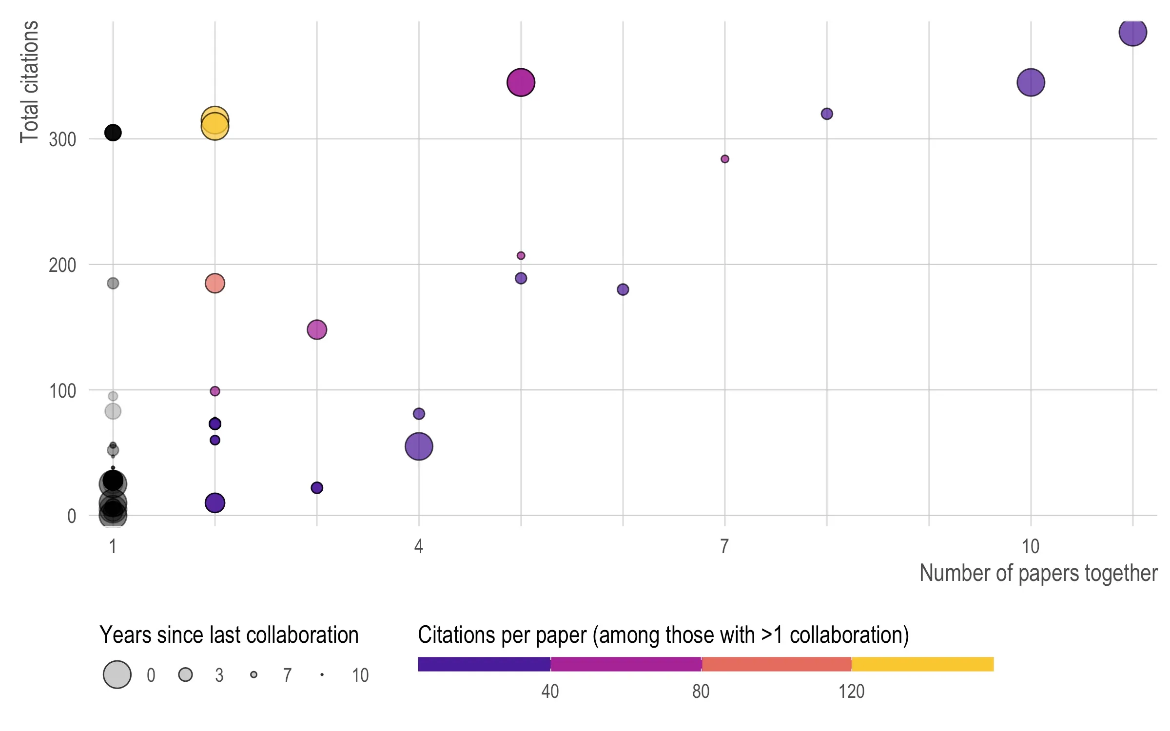
The answer (two yellow dots in upper left) is Nishant and Rafa at about 150 citations per project. (The upper right is Jarvis followed by Nancy.)
Code is here. Note there are five files and you need to change my_id on line 21 of 01_pull_data.R to your Google Scholar ID.