
ooking back on what I think can be fairly described as a chaotic year (professionally), three events really encapsulated what it was like being in academia. In January (2025), I was on an NIH study section that got cancelled as the new administration shook up HHS/CDC/NIH and did some mass grant cancellations. It eventually got rescheduled but I wasn’t able to attend — I can only assume it was as hectic as one would imagine. Then in April, I was excited to start working on my second NASEM consensus committee. It got abruptly cancelled by the CDC the morning of our …
A walk in the park
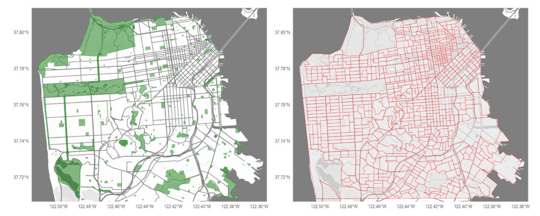
an Francisco has a lot of parks. Depending on who you ask, there are 230, 280, or 510 different parks, playgrounds, and green spaces spread across SF’s 47 square miles of land. In 2017, San Francisco became the first US city where every resident lived within a 10 minute walk of a park. Since then, many other cities have joined the ranks and SF isn’t even in the top 5 US cities anymore with DC, Irvine, Minneapolis, Cincinnati, and St. Paul taking up those spots. Still, every resident within 10 minutes walking distance to a park is quite the feat …
Debriefing our JAMA paper on vaccination in the US

bout three weeks ago, our paper modeling the reemergence of vaccine-eliminated diseases in the US was published. We used microsimulation to evaluate different scenarios of vaccine decline (and increase) in the US for four vaccine-eliminated pathogens: measles, rubella, diphtheria, and polio. The simulation incorporates state-age-specific mortality, state-specific birth rates, state-age-specific vaccination rates, and known disease parameters. Needless to say, it was a timely paper, and we hope it will be useful as the administration considers changes to the childhood vaccination schedule and vaccine approvals/procedures. Obviously, I think the paper itself is worth reading but there were a lot of higher level …
Catching up + Collaboration network update: 2010-2024

ou wouldn’t know it from the lack of updates on this blog, but it’s been a busy couple years. I’m sure I’m missing many important things, but a few highlights include: Ben’s JAMA Peds paper got a lot of media attention, which prompted action from Senators Duckworth and Durbin. A student paper on sub-national excess overdose estimates got published in AJPH after four years — just proving how resilient and persistent the new crop of PhD students are. Keith and I wrote a thing about how the “higher” or “lower” mortality really depends on your comparison group. Our JAMA paper estimating parental …
My collaboration network: 2010 to 2022 version
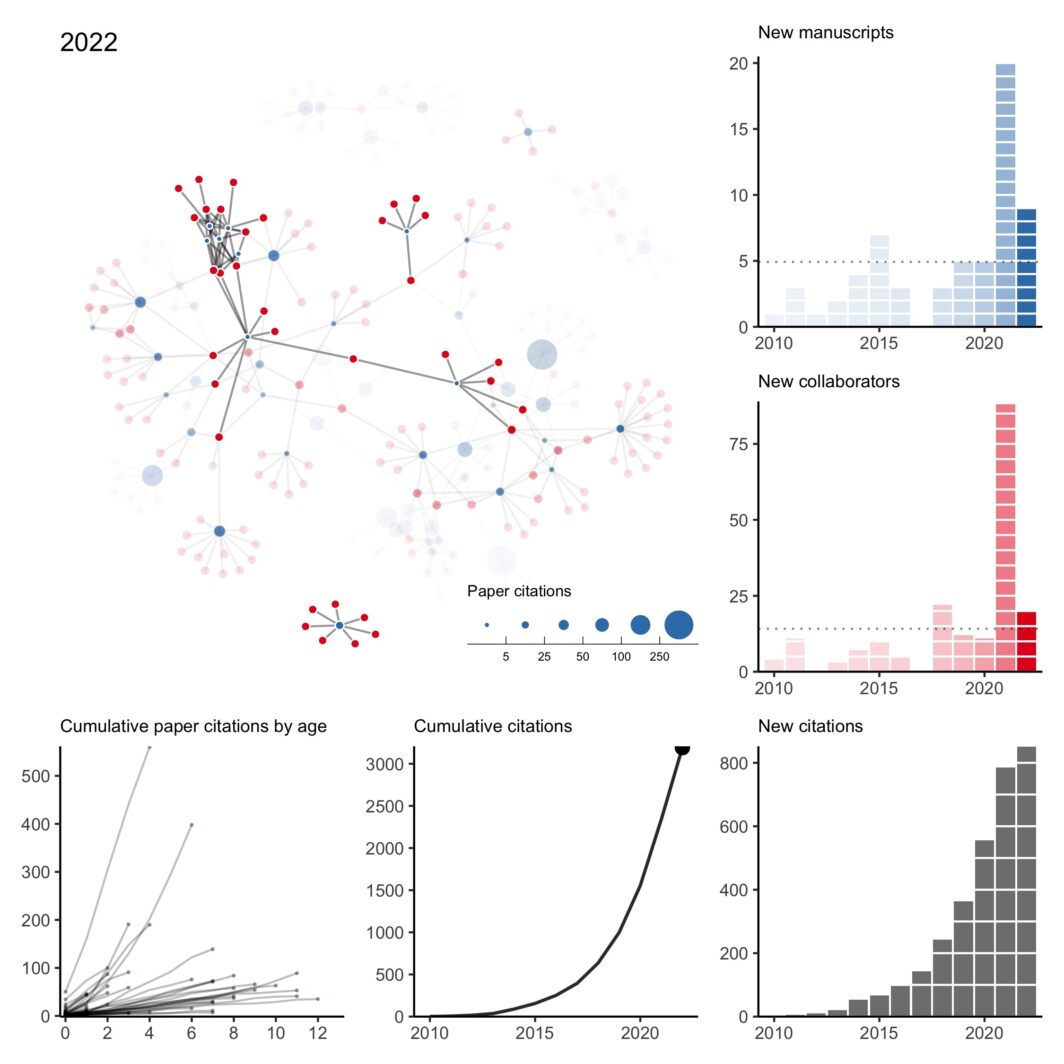
here was a lot going on last year and I missed my annual tradition of updating my collaboration network at the end of the year. However, thanks to a perpetual illness ravaging the house, I’ve found some sleepless hours to fix my old code and pick up the tradition again. As is always the case when I do this exercise, I can’t help but reflect back on 2022 (and 2021) with gratitude and appreciation for my amazing collaborators. It was my first year on the tenure-track and hours that normally would have been spent pushing research forward were instead spent …
Plots of my biking in 2022
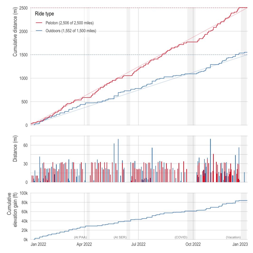
ne of the best things about living in California is having amazing weather nearly all year long (the current 3-week-stretch-of-non-stop-rain aside). So last year, I decided to capitalize on the weather and made a New Year’s resolution to bike outdoors more. Specifically, I wanted to bike 1,500 miles outdoors in addition to my normal indoor biking of 2,500 miles. (Also, with a side quest of 100,000 feet of cumulative elevation gain.) Below is a plot of my cumulative distance (and elevation) over the course of the year. I just barely got the distance resolutions with 1,551.7 miles outdoors and 2,506.1 …
It finally happened — I got COVID
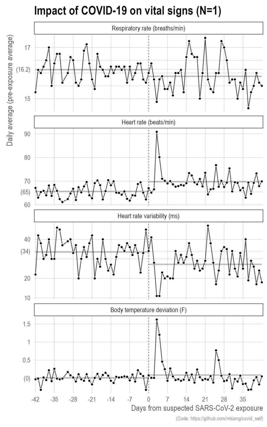
ast September, I got COVID. It was wildly unpleasant with serious brain fog that lasted for several weeks even after the other symptoms went away. That said, this did give me the opportunity to make some more plots based on my own data. Below, I show a few metrics of my vital signs (respiratory rate, heart rate, heart rate variability, and body temperature deviation) relative to my exposure (vertical dotted line) for six weeks before and after. The thicker grey lines in the background are the pre- and post-exposure averages for those six weeks.
My collaboration network for 2010 to 2020 (+ other plots)
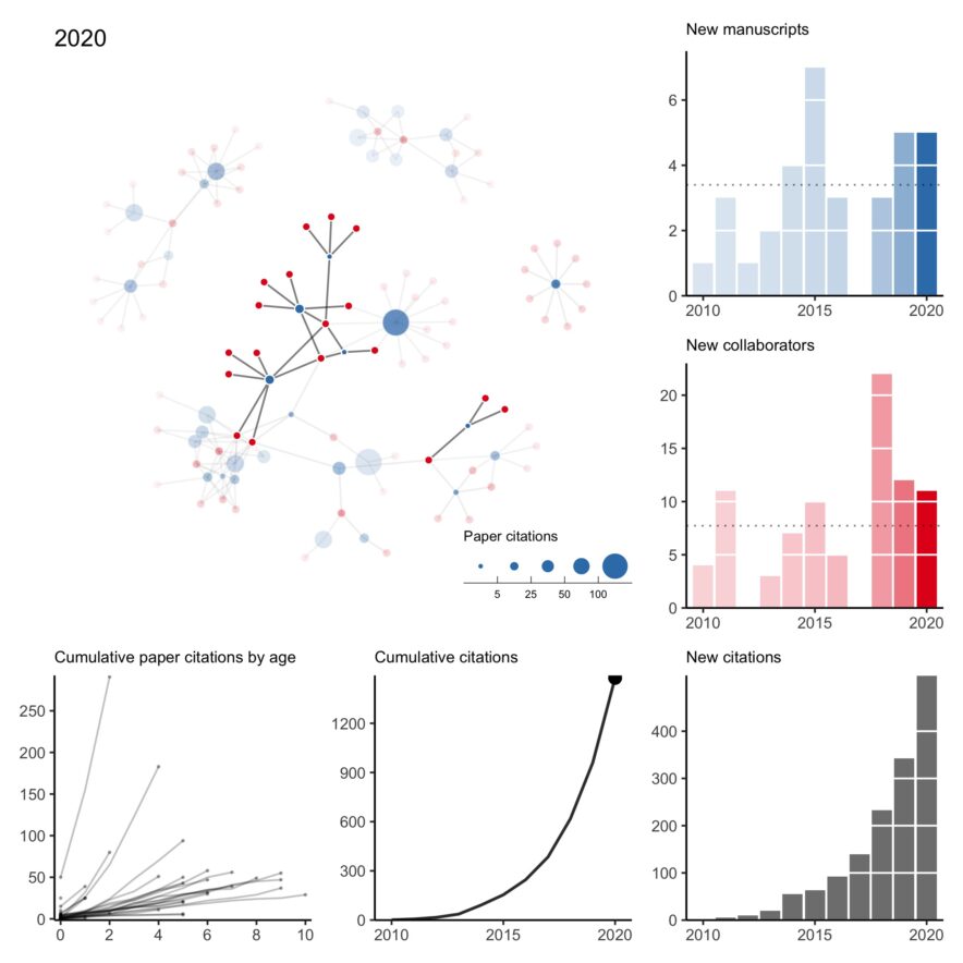
n what has become a bit of an annual tradition, here is my collaboration network for 2010 to 2020. This year was rough. Of the two first-author papers published this year, one was pre-pandemic. I think it’s fair to say this wasn’t the level of productivity I was expecting of myself. Hopefully, a few projects still in the pipeline will come out early next year. All that said, I’m thankful for a strong network of kind collaborators who picked up my slack when necessary, checked in on me even when we didn’t have an active project, and understood when childcare …
Applying an intro-level networks concept to deleting tweets
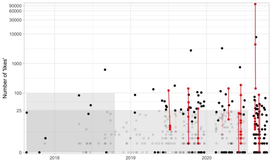
here are a few services out there that will delete your old tweets for you, but I wanted to delete tweets with a bit more control. For example, there are some tweets I need to keep up for whatever reason (e.g., I need it for verification) or a few jokes I’m proud of and don’t want to delete. If you just want the R code to delete some tweets based on age and likes, here it is (noting that it is based on Chris Albon’s Python script). In this post, I go over a bit of code about what I …
Our new paper about opioid prescribing patterns in the US
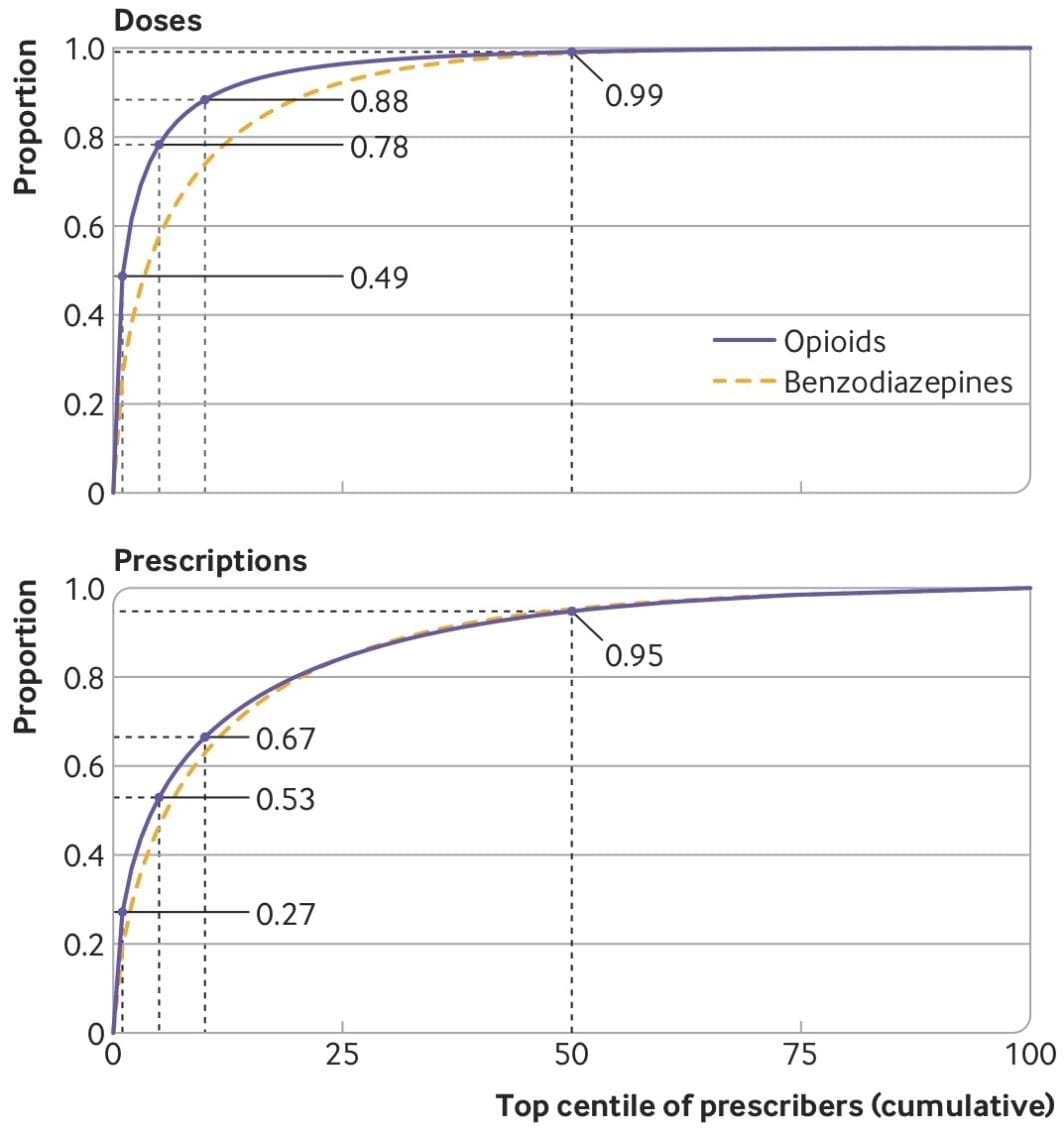
ome notes about a new (open access) paper with Keith Humphreys, Mark Cullen, and Sanjay Basu — “Opioid prescribing patterns among medical providers in the United States, 2003-17: retrospective, observational study” — just published in BMJ.
Collaboration network from 2010 to 2019
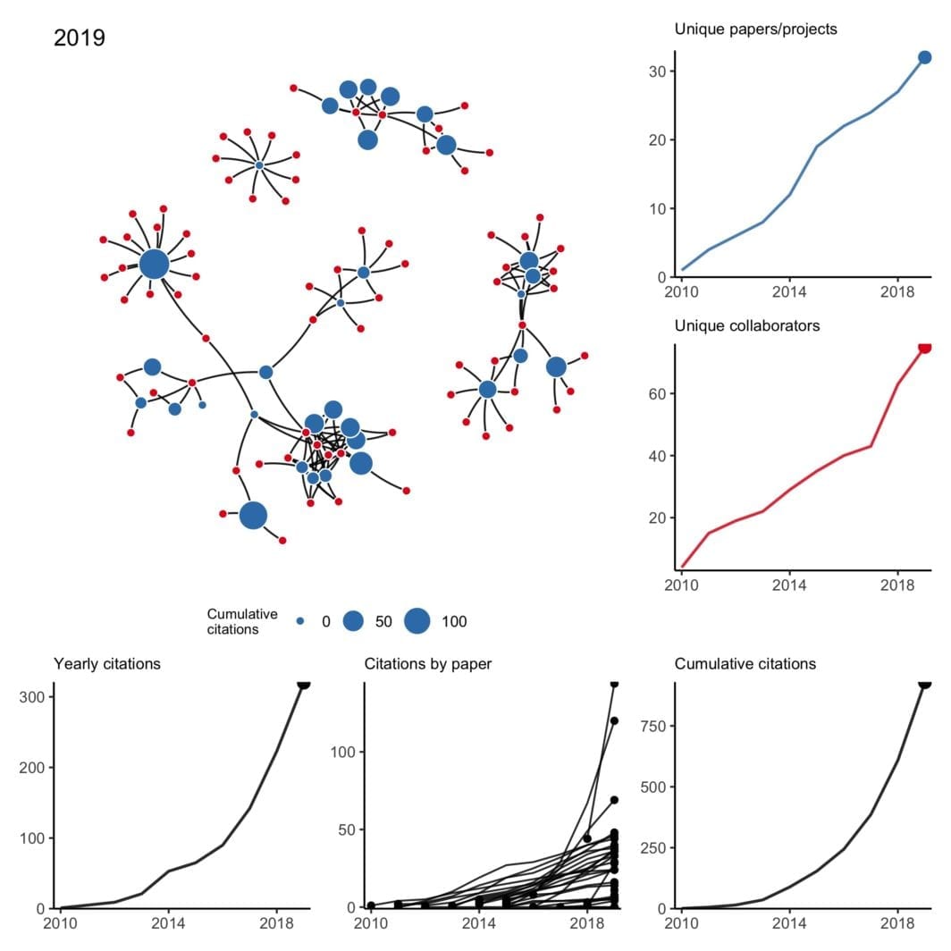
have been trying to wrap my head around working with temporal networks — not just simple edge activation that changes over time but also evolving node attributes and nodes that may appear and disappear at random. What better way than to work with a small concrete example I’m already very familiar with?
A visual tour of my publications
recently came across this paper by Michal Brzezinski about (the lack of) power laws in citation distributions. It made me a little curious about the citations of my own articles so I threw together a little script using James Keirstead’s Scholar package for R. In the plot above, every line represents a single article with time on the x-axis and (cumulative) number of citations on the y-axis. It’s not super informative, so we can break it down a few ways to graphically explore the data.